SIA’s multi-billion-dollar cabin overhaul promises ergonomic perfection, but beneath the polished marketing and promises of elevated comfort lies a growing debate over whether these redesigned perches truly deliver on aesthetic appeal
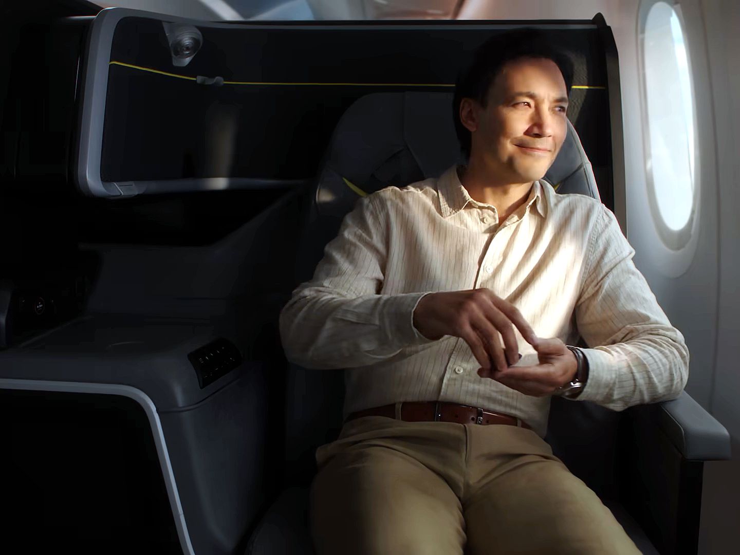
The new Business Class on Singapore Airlines as seen in their new television commercial
Social media requires precious little fuel to catch fire—a seat or two usually does the trick. Better still if they are cabin seats, and those on Singapore Airlines planes are especially easy to torch. Our national carrier recently launched what has been described by the media as the “next-generation seats”, slated for service in 2027. A S$2 billion project that spanned eight years was, however, slammed in three days. SIA’s new Business Class seats bear the brunt of the criticism, serving as the designated chope-ing board for everyone’s real or imagined design frustrations, despite having done nothing to earn the title. If you spend enough time on any of your favourite platforms, you’d think that SIA had revealed the interior of an SBS cross-border bus used as a dental office.
The Business Class seat strikes us as a classic example of a product occupying an uncomfortable middle ground. It is neither spectacularly beautiful nor offensively hideous. Social media, it appears, hates middle ground: unspectacular easily becomes ugly. Many people understand masterpiece and disaster, but struggle with the decent, the competent, or even the evolving. To be certain, like the majority, we were not invited to the SIA launch event. What we have seen is limited to whatever is available online and what SIA has shared. To us, the Business Class seats look less distinctive than expected. But for a startlingly large number, their eyes were under attack. The language used has been vastly stronger than the evidence. Huffing, after all, is rarely more than puffing.
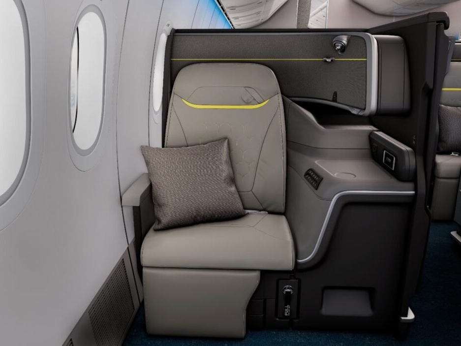
Publicity photo of the Business Class seat that seems to have upset many on social media
Business Class is where SIA’s prestige narrative has historically lived. It is the cabin most associated with corporate travellers, aviation enthusiasts, and aspirational imagery. The question we should ask is not whether it offers a good seat, but whether the new design is worthy of Singapore Airlines. But that is an almost impossible standard, because everyone has their own imaginary version of what “worthy of Singapore Airlines” actually means. Some demand sartorial warmth and material richness, others lean toward futuristic minimalism or a more distinct Singaporean identity, and then there are those who simply want Cathay Pacific. SIA cannot satisfy all of those desires simultaneously. Middle grounds rarely produce visual masterpieces, but these Business Class seats are far from vile. If you look at the seat as a whole and apply even the most basic aesthetic consideration, it is not half as bad as the outrage machine suggests.
While most were hung up on the “Scoot-ification” of Business Class seats (as social media now gleefully calls it), we looked at those in other cabins too. And to us one thing stuck out clearly: the cabins didn’t seem to belong to the same universe. A well-designed airline product isn’t just three seats. It is a narrative running from First to Business to Premium Economy, and, ideally, Economy too. We did not, however, clearly see different expressions of the same brand. The materials used may differ, the level of privacy may differ, the amount of space may differ, but there really should be family resemblance. Even from just looking at the publicity photos, we thought they were tear sheets from different magazines. A media veteran would call that a failure of editorial coherence. Even if each page is excellent, they do not come together for a singular aesthetic identity.
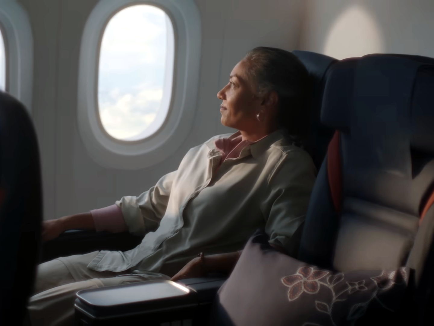
The new Premium Economy seats
The key issue to us is not the design quality of any one seat, but the apparent absence of a singular, visionary creative force hovering above all designs asking a simple question: do they belong together? As it is often said in publishing, you can have four beautiful pages and still produce a terrible magazine. Similarly, you can have four perfectly competent seating products that fail to create a coherent airline identity. And for a brand like SIA, coherence matters disproportionately because SIA’s reputation has always rested on orchestration. Those who have travelled with the airline often associate SIA with consistency, refinement, and polish. And to that, we’ll add, harmony. The airline’s premium image comes from the sense that somebody thought carefully about how every element relates to every other element. Then, suddenly, we see a lack of visual communication between seats.
SIA often feels as if it has brand custodians, but not always a strong creative director. Those are different roles. Design decisions can feel individually defensible, but collectively unresolved. Without a singular authority holding the pen, a brand can easily lose its soul to corporate process. The creative director exists for one fundamental reason: to act as the ultimate arbiter of taste and tone. Their role is not to make everyone happy, but to enforce an uncompromising aesthetic coherence across every single point of touch. Historically, SIA got away without an obvious star creative vision because its brand was remarkably coherent. And they have one unifying force: the Singapore Girl. She is arguably one of the strongest examples of creative direction in the airline industry. Sure, the Singapore Girl had been around since 1972; she is neither modern nor young, but she communicates a very specific idea: hospitality.
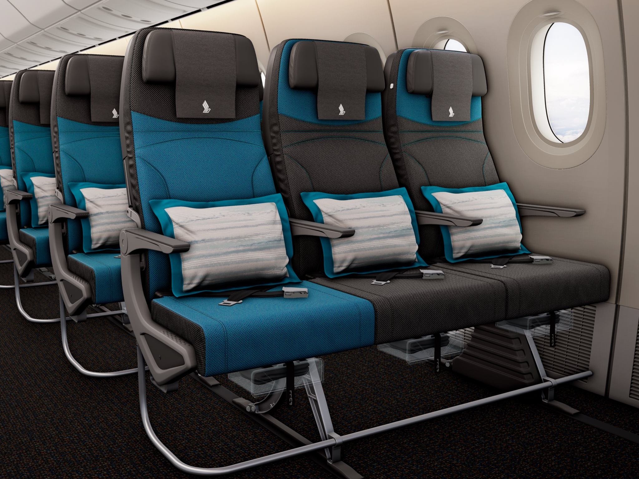
The sudden pop of blue in unmistakable Economy
We remember a conversation we had with an aviation professional some years back. He told us that, in his line of work, “SIA is the Prada of air travel. The rest are still trying to be Coach.” That was a deliciously sharp verdict—and entirely typical of industry insiders who measure reputation in cut and clout. But we agree that this is the difference between shouting your credentials through the cabin speakers and letting the stitch work do the talking. Luxury brands that endure usually have someone or a small group obsessing over the threading. Without that, it is easy to end up with products that are professionally executed, but strangely anonymous. It was revealed that SIA used a trio of different design firms across all cabins. If the new cabins feel like products from three different studios solving three different briefs, the issue is less luxury versus budget, and more identity versus fragmentation. That’s a much harder problem to diagnose from mere seat photos, but it’s also a much more consequential one.
Which brings us back to the public reaction. Many of the social media critics can’t really articulate any of this. So they reach out for “look like Scoot” and “Scoot-ification” and think it’s clever. If the criticism were “the seat looks less comfortable”, we’d be having a technical debate. Instead, it seems that most people are reacting to is a collapse of visual hierarchy. For decades, SIA’s premium cabins projected a certain kind of luxury grammar—dark wood, warm metallic finishes, rich, saturated colours—but now, it’s a much more difficult problem to solve than simply changing a colour palette or adding more wood veneer. A strong creative director can make a modest budget feel luxurious. Without one, even a lavishly funded product can feel like several disconnected projects sharing the same logo. As they say in the fashion industry, a creative director isn’t a luxury—they’re the single thread that turns disparate parts into a coherent brand.
Photos: Singapore Airlines. Screen shots: singaporeair/YouTube

