The latest to join the display of bullet-point outrage is the all-new Singapore Press Check
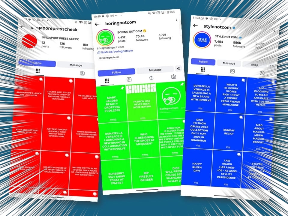
We’ve been receiving messages from readers and friends wondering if we are behind the latest fast-food opinion oblongs for the terminally online: Singapore Press Check. The page on Instagram was born on National Day this year, but they seem to be getting notice only recently. It is coloured in the retina-loving red of ang ku kueh (红龟粿), but no explanation is needed for the unsurprising chromatic choice. Within the parallelograms are short, typically-snarky text that are presumably antidotes to fashion marketing. The words are in full caps, as if the messages are not loud enough. When Singapore Press Check emerged that red letter day, it was a five-slide post that opened with wishing the nation a “happy birthday” and proceeded to state, “though apparently not to our Singaporean magazines,” immediately establishing a false binary that equates a commercial fashion magazine’s August publishing schedule with state patriotism. And they go on to talk about the lack of representation on, presumably, the covers, naming Vogue. You get the flavour.
The individual remarks perhaps matter not. The container is the brand, the colour the signifier. Because nothing screams rigorous, independent institutional scrutiny quite like matching your colour sense to a Pantone swatch card, designed to pop on a smartphone screen. It’s insider emergency with the siren wailing. The colour does not aid clarity, but it serves as tribal war paint. And in social media, it is scarily tribal, with tribal leaders acting as high-speed digital newswires and community curators that command the attention of the fashion industry and its attendant tribes. There is no discussion of this without mentioning the digital chieftains Style Not Com and Boring Not Com. Although both operate differently and adopt dissimilar voices, they use the coloured box as a weapon of rapid-fire fashion commentary. To be sure, Boring Not Com models itself after Style Not Com in both nomenclature and visual impact. Singapore Press Check is a derivative of a derivative. None of them actually invented the format.
The colour does not aid clarity, but it serves as tribal war paint
They inherited a long visual history of internet memes, combined with a built-in Instagram tool, and harnessed for the industry. But before them, there was Diet Prada, dominant internet fashion snark. Born in 2017, they were the pioneers of call-out culture. Nearly ten years later, they slid from a disruptive, must-read industry watchdog to a mainstream media entity—exactly the reason the Not-Coms and their ilk were able to take over. Diet Prada essentially fell victim to the ultimate paradox of digital tribalism: they became the very establishment they used to critique. The transition from outsider to insider was complete when Gucci invited Diet Prada to take over the former’s Instagram Stories during the brand’s spring/summer 2017 show. Fans cried, “cop out.” Money sang, “we win.” But Diet Prada’s traditional format—scrolling through multi-slide image carousels and reading long, dense paragraph captions—began to feel slow and tedious. The audience got lazy, and the social media parrots were more than happy to supply the junk food.
Style Not Com was launched in 2021 by Beka Gvishiani, a Georgian “brand consultant”—the typical professional metamorphosis of influencers—who formerly worked at the label Anouki, where he was the general manager for five years. The IG page established its signature “Colette-blue” background with high-contrast white, all-caps, serif text. The voice is positive and enthusiastic, generally in the register that would make PR directors hear the fulsome pitch even in their dreams. Boring Not Com, exposed by Lauren Sherman to be British stylist Rasharn Agyemang, uses the exact same minimalist coloured box layout, but swapped the palette to neon green, proving that uninspired architecture can look questionable when you turn up the voltage. The messages are sarcastic, cynical, and blunt, speaking directly to fatigued fashion fans. Sometimes, their reveals are made ahead of official statements, but indifference is their entire operating model; protocol is simply something that happens to other people.
The messages are sarcastic, cynical, and blunt, speaking directly to fatigued fashion fans
And then came the red snow skin durian moon cake. The identity of the architect behind Singapore Press Check remains entirely in the shadows for now. There hasn’t been a Puck-style unmasking to drag them out into the daylight. Many media watchers think they are unlikely outsiders, but those embedded within the ecosystem they are critiquing and who have spent enough time in the local trenches to know exactly where the bodies are buried and how the jargon works. Like their predecessors, the purpose of the page is not necessarily to evaluate fashion.“The celebs at Prada last night?” went one post. “Tragic. Do we not have anymore cool celebs in Singapore? I think PR managers need to work harder on talent spotting.” There is a difference between observation and insult. Seriously, a throwaway observation is given four slides to be the finished product? The post adopted the tone of somebody possessing deep knowledge of celebrity ecosystems, who has access to industry dynamics and sophisticated understanding of branding. But the actual content is remarkably close to: I didn’t like who showed up.
That is a profound shift. Historically, criticism was subordinate to the thing being criticised. The collection or the event came first. The review was a response, however cutting. Today the algorithm requires constant output, so criticism increasingly becomes self-sustaining content, like a fountain that feeds itself endlessly and recirculates its own stagnation. The criticism no longer needs a significant object. Any object will do. This isn’t even a pull quote, but correction margin, definitely not body text. Occupying four slides, the post is not offering information other than broadcasting the author’s relentless availability or social positioning. He is attending the parties that he is not enjoying. Posts are then little more than digital check-ins. The tragedy, if there is one, is that this is actually much closer to gossip-column writing than criticism. It reveals a lot about the consumption of criticism today. Readers prefer positions than arguments, so the critic becomes less a reviewer than a social compass. Singapore Press Check is only slightly more than a month old and it already insists on reading less like criticism and more like a continuous stream of typographic scolding.
Illustration: Just So

