There are brands fully aware that summers are getting scorching, more and more so, and then there are those designing coats for a cruise to Antarctica. Bottega Veneta appeared to be the latter
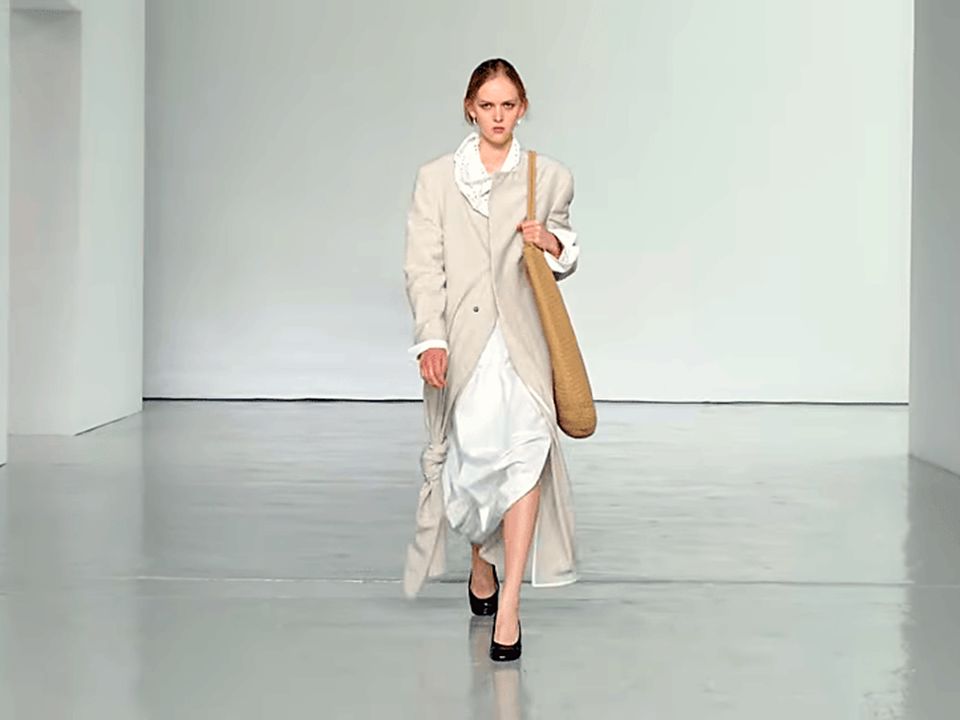
We used to be immensely fond of the designs of Louise Trotter. We enjoyed her work at Joseph, then Lacoste, then Carven. One season after she took the reigns at Bottega Veneta, we began to develop a sudden, crippling suspicion that we might actually be wrong about her suitability for the house. Make no mistake: Ms Trotter possesses both technical skill and a voice of her own—though that signature timbre now leans rather heavily on the listener. With BV, her aesthetic signature has grown somewhat laboured, even tedious. It was so for the previous collection, but that was for autumn/winter 2027, yet even then, the clothes were unnecessarily bulky. For her spring/summer 2027 collection, she stubbornly carried that ponderous feeling right through. Europe endured one of its most brutal summers this year, yet the collection seemed expressly tailored for the Nordic tundra. It barely felt Mediterranean. There was nothing wrong with the overabundance of outerwear, except that it gave the distinct impression of having strayed into the wrong half of the year.
For her third runway presentation, Louise Trotter’s stated premise was the liminal moment between seasons: the transition from protection and layering into something lighter. She described it as an exploration of the ”in-between”, telling Vogue that meant “between what we see and perceive to be protection, which is winter, and then de-robing as we go into spring, summer.” By “we”, she presumably meant those fortunate enough—such as her—to reside in the northern hemisphere, where seasonal transitions actually dictate the shedding of coats rather than a permanent, humid equilibrium. That leaves the rest of us to wonder precisely where that places populations sweating through an eternal, unchanging 32°C without a single meteorological “in-between” to justify the theatrics. The collection then described the reduction of weight, not the temperature outside. That’s a very Northern European feeling of spring, where the emotional significance lies in emerging from winter rather than arriving in summer. Unlike her predecessor Matthieu Blazy’s periods of everyday realism elevated into luxury, Ms Trotter’s BV increasingly feels like a study in controlled release. She doesn’t throw the windows open. She unlatches them a few centimeters. The heat won’t come through.
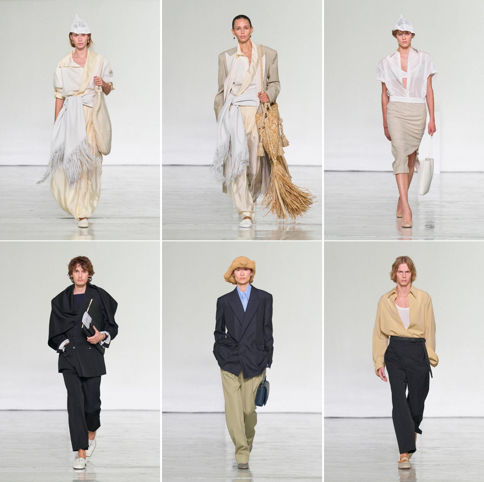
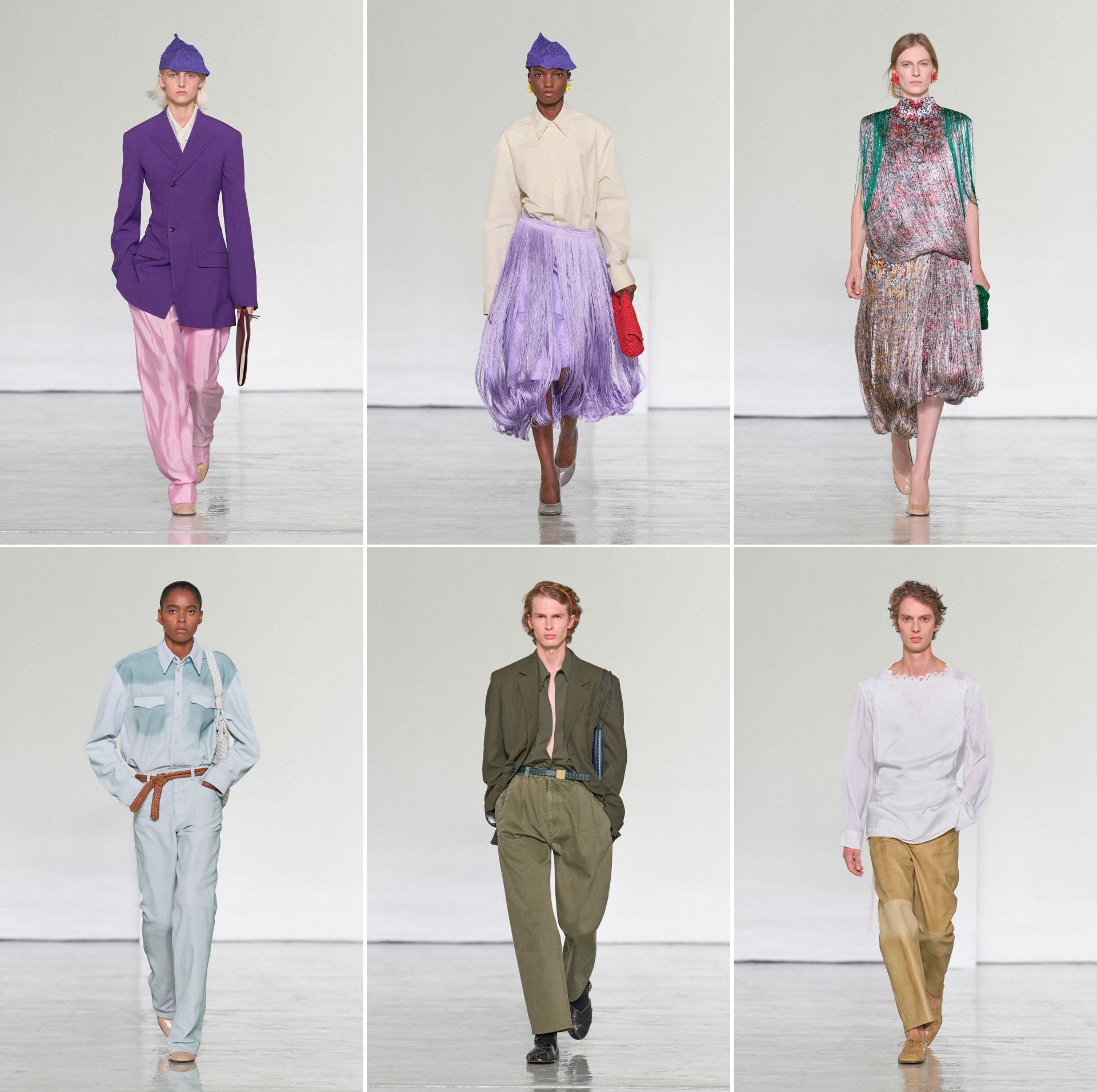
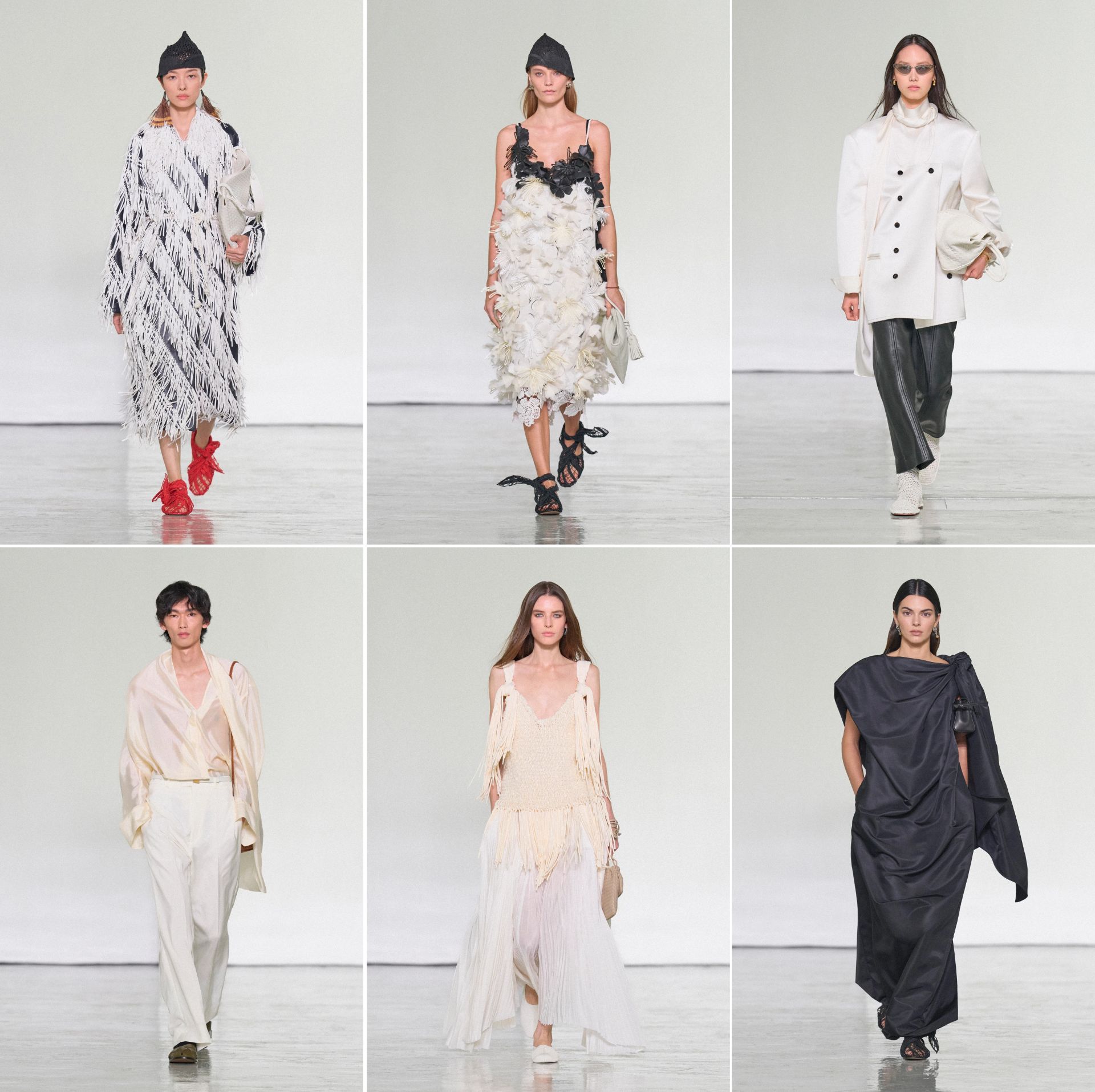
We are, therefore, deeply fascinated by the last dark grey dress that Kendall Jenner wore to close the show (photo: bottom right). It has become one of the most shared on social media (hence, adored?). Even at the finale, the visual memory isn’t one of sun, exposure, or Sicilian exuberance. It’s cold and cheerless restraint. Fashion and social media immediately elevated it into a masterpiece because it looks fetching on a page and a grid. A quick glance and it delivers a lot at once: volume, asymmetry, (apparent) effortlessnous, movement, and, perhaps crucially, a dramatic silhouette. In a three-second Instagram reel, they are enough. What struck us was that the garment’s intellectual proposition seemed surprisingly thin relative to the reverence surrounding it. One side appears gathered and knotted. The other side falls in broad draped planes. Nothing totally not seen before. The visual effect came overwhelmingly from quantity rather than transformation. In sum, we saw a flaccid sack, which said to us that the fabric determined the silhouette, not nearly the designer. There could be a confusion between scale and design. This, to us, was a recurring luxury phenomenon: the aestheticisation of excess fabric.
It is understandable that at BV, this was so. Ms Trotter needed the surfeit of fabric and, consequently, the extended surface area. The collection has been described as “heavy on craft”. What if the collection didn’t feel un-summery because Ms Trotter misunderstood summer? What if it felt un-summery because craft required acreage? Bottega Veneta’s biggest asset is not a silhouette, nor a cut. It’s definitely not a logo. It is surface. Without it, there would be no intrecciato. And for the intrecciato to be seen, it needed expanse. Similarly, the weaving, knotting, perforation, fringes, and engineered textures had to occupy enough visual real estate for the audience to register that they existed. So, a raffia bag and its impractical, ultra-long fringing had to be, in total, larger than the ankle-length skirt of the user. Sure, tailoring remained central, shoulders retained a degree of structure, and leather was everywhere, admittedly lighter and more pliable (does leather really first come to mind in summer?), but a large leather or raffia surface became a billboard. A logo was not, a trim was not. Louise Trotter offered a craft billboard. The garment served the craft target, rather than the other way round. And then the runway became the exhibition of the métier. It was really just showing off.

