Not quite, but there’s that green and not any green
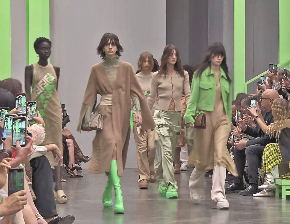
To be sure, there are other colours in Fendi’s spring/summer chromatic proposals, but it is that green that bothers us. Two weeks ago, Kim Jones dabbled with the blue of Tiffany for the resort 2023 collection. They appeared on clothing and accessories. That particular blue is so associated with the brand that it bears the name of the company. And it is so identified with the retailer’s boxes and paper bags that it’s hard to imagine it for boiler suits and, harder, for the Baguettes. Yet, the colour was used sufficiently. And now for the Fendi RTW, there is that what-do-you-call-it green. To be sure, this does not have the same visual impact as Bottega Veneta‘s eponymous green, introduced under former designer Daniel Lee’s tenure, during the spring/summer 2013 show. Still, it perplexes us, especially when a model in a pair of platform slides in that green nearly fell and, out of her own safety, decided to remove them, and hold them in her hand. Are they uncomfortable slides? Are they hard to walk in? Is it the green that should be on kindergarten walls, not clothes or footwear?
If a bright green is not your thing, there is that pink. It is not a Barbie pink or a Millennial pink. It is one that could be considered grown-up pink perhaps, not too sweet, with just the right amount of brightness that, like the green, would draw attention, or stop traffic. In fact, the green and the pink (some call it flamingo) remind us of those used to distinctively colour Tyvek wrist bands—the ones cuffed on you to identify you as guest, paid or invited, at festivals, raves, or private events. And then there is the blue, the final of a trio of key colours. The blue is not as eye-catching as the other two—somewhere between lapis and Miranda Priestly’s favourite cerulean (after the Tiffany blue, they do not need another that bright?). These colours give the pop to an otherwise rather neutral palette, one that perhaps underscores the wearability of the collection. If the clothes are a no-brainer, then perhaps the colours could pique?


Kim Jones most definitely created many wardrobe friendly pieces with the 66-look collection. These are clothes for the pandemic-over world, when you are out and about, when you want to be dressed to mark a return to fashion and fashionable company. For quite a while we’ve been confined to not just our cheerless existence, but our drab clothes. With our social life back in full swing, the clothes must reflect that too, with more than a hint of the late ’90s and what we increasingly identify as models’ off-duty looks. Easy cardi and combat pants: How not off-duty are they? To be sure, there are on-duty looks too. White shirts under sweaters and teamed with slim skirts: How not on-duty are they? But if you are a socialite and that your duty is bound to that, there are plenty to delight those who desire a fashion language to communicate with those who might benefit from the knowledge that the wearers they are looking at are rich.
But if you need that message to be loud and clear, there is always the double-F logo of Fendi. Designed by the late Karl Lagerfeld in 2000, the broad, blockish, almost brutalist logo was primarily used as a buckle for accessories. But these days, they can appear anywhere, as seen in the resort 2023 collection, staged in New York to celebrate the 25th year of the Baguette, a bag that was wildly in demand also because of the double-F buckle. This time, the oblong metal with the two short lines within appears on straps to secure pocket flaps. But if that hardware is just too subtle, even obscure, how about sweaters with hems that can be turned from inside out—and up—to reveal another version of the double-F logo followed by the rest of the letters that spell Fendi. Perhaps that is more confidence-boosting than a shot of colour.
Screen grab: Fendi/YouTube. Photos: Fendi

[…] green in a colour story that is generally muted. It led us to wonder if it’s the same shade at Fendi last month, even if a tad toned down in intensity? Seriously, is the maddening mash-up just Matthew […]
LikeLike