With new uniforms designed by Odile Benjamin
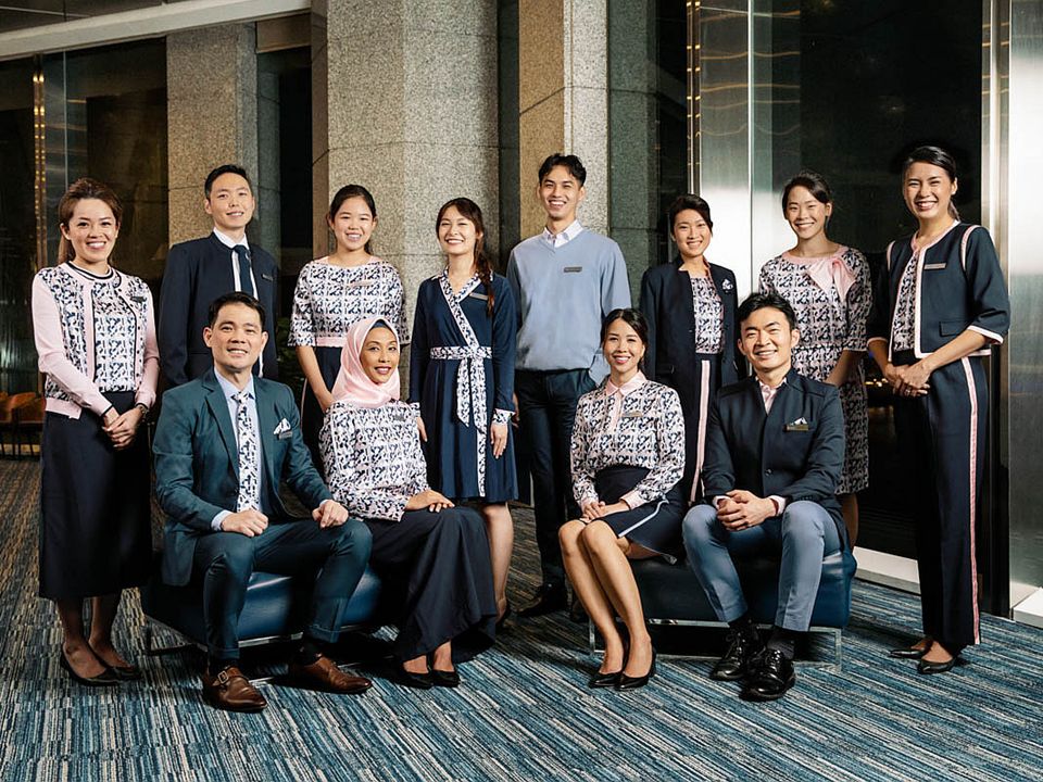
If you walk in into any United Overseas Bank (大华银行) branch today, you might notice something different. The branch interior would not have received a makeover, but members of the staff that you meet are likely outfitted in new uniforms. At the main bank in UOB Plaza this morning, all frontline personnel went about their work, seemingly pleased with how they turned out. And the new look came with smiles too. Most of the staff wore their corporate attire without an additional outer, even when jackets and a cardigan are offered. And this no-layering, too, is apparent in the other branches, where, as it appeared, the new uniforms were not completely rolled out. Some staff members were still seen in what seemed to be pieces from their own wardrobe.
First impression: The uniform—comprising different looks—is not ugly, but there is something not quite the present age about it. There are eight looks in the women’s (and possibly more since they are reportedly allowed to “mix and match”) that afforded a new—matronly even when abstract—print to prevail. In sum, the looks try to effect corporate chic, but what we saw, as we sat in the vast banking hall, appeared to us like those of old hotels; what receptionists and lobby lounge waitresses were attired in. And, as if to concur with what we were thinking, an elderly gentleman waiting to open a fixed-deposit account, said to us that the women’s uniform reminded him of the old (long closed) Ming Court Hotel (presently, Orchard Rendezvous Hotel), where Orchard and Tanglin Roads meet. A fashion stylist later WhatsApped us to say that the uniform “really looks like it’s for the hospitality industry”.
What could possibly lead to such an impression and evocation? To us, the shapes (and details) of the clothes were not based on blocks that could be described as contemporary. A dress with a band neckline and a bow worn skewed to the left looks unmistakably like a uniform, but it has the whiff of one from the ’70s. We did not have the benefit of a parade of the entire collection, but from images shared by UOB to the press, we could see a twin set, a wrap-dress, a shirt-as-blouse paired with a slim-fitted (in the past, it would be called tight) skirt (and worn, unsurprisingly with court shoes!). And the most interesting, a cropped, round-neck jacket with piping on the perimeter, armhole and hem of sleeves—if the lines are not enough, there is the stripe on each of the out seam of the trousers, such as those that appear on track pants or those trousers worn by members of a marching band.
The uniform—comprising different looks—is not ugly, but there is something not quite the present age about it
UOB’s Deputy chairman and CEO Wee Ee Cheong told the press: “As ASEAN re-starts its engine of growth post-pandemic, it is timely for the bank to unveil its sharpened purpose and brand refresh.” The refresh of the uniform comes some 11 years after the last one, designed by Song Wykidd of Akinn (and once the other half of the Club 21-backed Song & Kelly), and revealed in November 2011. The latest is designed by Odile Benjamin. If the name is familiar, it is because Mrs Benjamin was, together with her husband Douglas, part of the design duo behind the now-defunct Raoul, a label under FJ Benjamin, former retailer of Gucci and, later, Givenchy. Raoul made international headlines when the Duchess of Cambridge Kate Middleton (now Princess of Wales) wore one of their dresses during her visit here in 2012’s Jubilee Royal Tour.
After the closure of the once-lauded Raoul, Mrs Benjamin started Estair almost right away in 2017, self-described as “a 360 degree outsource solution for fashion companies, specializing in children’s and women’s wear”. She has, of course, produced for other brands before, such as the ill-fated Ashley Isham diffusion line, AI. That Estair’s strength is not in menswear (which is curious as Raoul began in 2002 as a shirt label) is perhaps evident in the UOB uniform for the guys. With standard shirts, plain pullovers, and oddly-fitted jackets (one style sporting what looks like upturned lapels and a strange, prominent yoke in the front), the guys’ pieces seem designed to look relaxed, but turn out sloppy. Pants come with legs that are calf-enhancing skinny, perpetuating the Raffles Place belief that such narrowness is a professional standard. And, the men clearly have less to play with than the women.
While aesthetics deemed retro (including prints, such as the new, grid-like abstraction of the bank’s three-letter initials and their famed Vitalità bronze statue situated outside UOB Plaza, facing Singapore River) would not entirely lose favour, even among those whose profession requires no uniformity of dress, it seems a tad off-message for a bank that is looking forward, particularly to its 100th year in 2035. Yet, how the UOB uniforms turned out is perhaps not surprising. Mrs Benjamin told the South China Morning Post in 2015 that she found the ’70s to be “the most iconic fashion decade”, and her personal style is a reflection of that. And, her creative output too (hence, the wrap-dress?). When worn, the clothes can’t escape appearing old-fashioned or, worse, dated. One of UOB’s new messages that would be communicated regionally is a three-word catchphrase: “You are unique”. Which may inspire the question: In 87-year-old UOB’s banking halls, are uniforms still necessary?
Photo: UOB

They definitely do not look good
LikeLike
It’s hard to understand why this looks modern at all. As you pointed out, do they even need uniforms?
LikeLike
[…] have conceived easily puts them as a progressive against other banks. Just as UOB, for example, goes retro with its public image, OCBC is looking rather […]
LikeLike