Lame designs can be instructive: they convince very few
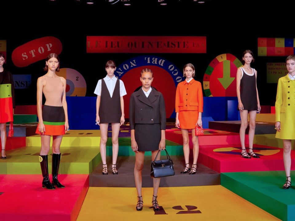
The one thing consistent about Dior under Maria Grazia Chiuri’s watch, apart from unstoppable sheer skirts, is a design sensibility that does not arouse the senses. In a word, banal. Or, another, closer to social-media speak: blah. In fact, it’s hard to find a description not the opposite of dull. Fashion professionals always avoid using the three-letter B-word. So we shall, too. But when we run out of synonyms, what are our options, really? Sure, being Dior, the vêtements are not crummy per se. But as designs not more expressive than just clothes, even if they are well-executed, can we honestly resist the simple lousy? Dior’s spring/summer 2022 show is high on colour, but why is it so low on excitement? So young, but so without spirit? So sporty, yet so enervated? It can be imagined that many women would find much of the styles “cute”, but how does cuteness really advance the house that, for so long, has been associated with grown-up sophistication?
Ms Chiuri has been described as being at the “apex” of her career. A woman designing for women, a mother with a daughter as “cultural advisor” in the same office, a feminist unafraid to speak her mind, she has the ambassadorial advantage to effect a more design-forward influence. Yet, her output is largely a commercial exercise. It is mostly devoid of wit or flair, superscribed by big hits such as the seen-everywhere (and much copied) Book tote, and pitched for gushing reviews, whether they are truthful or not. Or, for the survival instincts of reviewers such as Suzy Menkes, who gleefully posted on Instagram that Ms Chiuri has “a particular skill in picking out the spirit of the moment”. Wow!
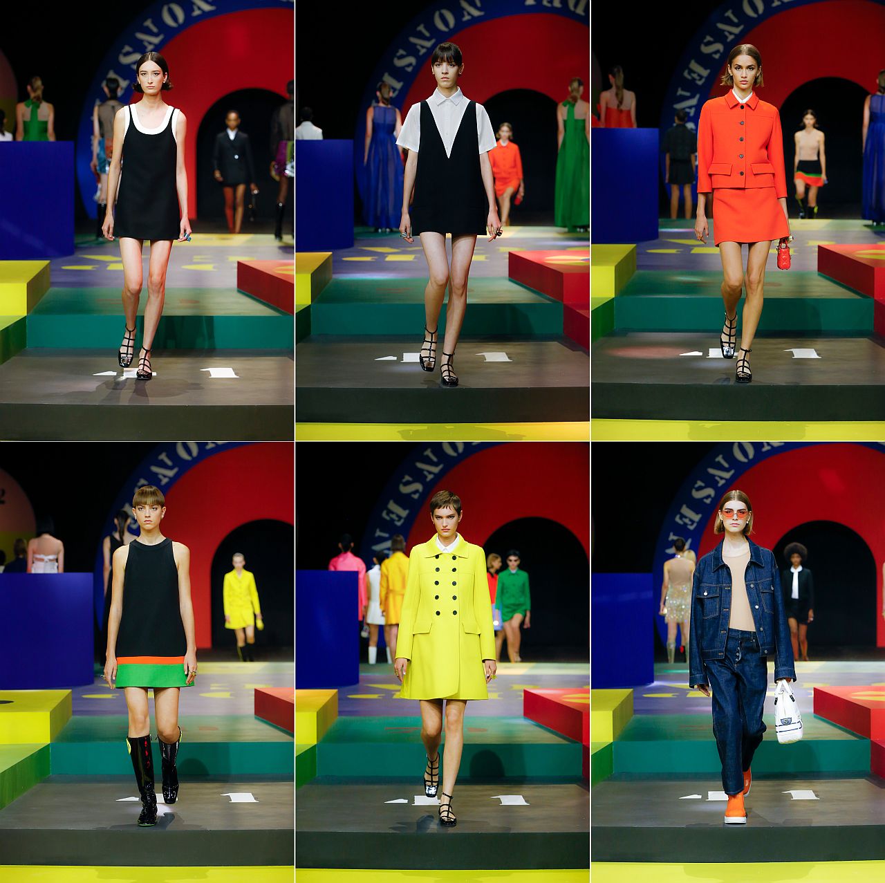


What could this “spirit of the moment” be at Dior for next spring and summer? Immediately discernible is the throw-back to the ’60s, with a go at the colour wheel. There are mini-skirts, complete with go-go boots, and whatever screaming girls used to wear when they thronged to meet their idol-band, The Beatles. But the reference point, to be more exact, is Marc Bohan’s Slim-Line collection of 1961. Youthquake(!), but nothing trembling with newness, let alone innovation. Wait not for the aftershocks for once the season is over, you’ll find it hard to remember any of the pieces. Definitely not those vaguely modish mini this, mini that, the numerous “cute” skirt-suits (some with shorts or culottes), and those ringer-style tank-dresses! Curious is the septet of unflattering separates that seem to mimic boxing wear (like in Milan, there are bras to go with the shirts and shorts, under which are unnecessary skin-coloured base garments), and even more baffling is the white union suit that could have been Baby Gap made for grown-ups. Or, to borrow from Karl Lagerfeld referring to sweatpants in 2013, “a sign of defeat”.
While other houses such as Saint Laurent proudly wear their Frenchness on their sleeves, Dior does not, and is, in fact, becoming more, er, Italian? Or Roma, the place of Ms Chiuri’s birth? Is this her strategy? Seems so. The scenography is conceived by compatriot, Anna Paparatti, considered a key figure in the Roman art scene of the ’60s, who created the set based on the Roman night spot of the same era, Piper Club (which still exists!), thought to be the city’s own Studio 54 back then, while the soundtrack is sung live by the Italian indie electro-pop band II Quadro di Troisi, attempting Italo-disco in considerably lesser beats per minute. What should we take away from all this? Viva Roma?
Photos: Dior
