Apparently not. Dior shows that there really can be no limit to the use of their name and initials
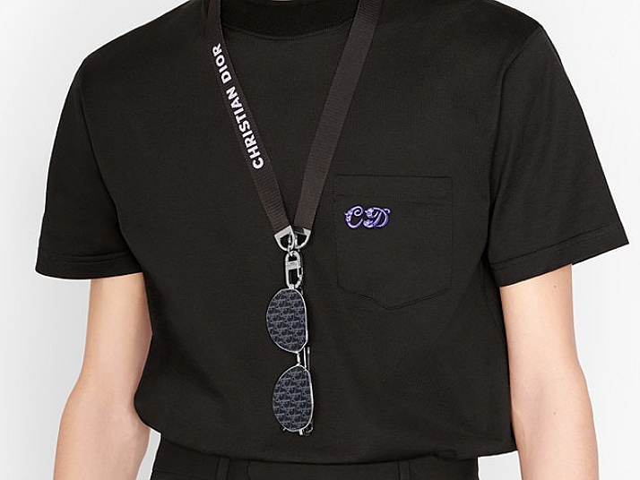
Kiasuism has hit luxury brands, in particular Dior. Sure, we have seen before the unceasing use of their logos and monograms on much of what they make, but we have yet to see branding so concentrated in a single product, as the above sunglasses, the Blue Dior Oblique Pilot, also known as the CD Link A1U. When paired with their Sunglasses Cord and the Dior X Kenny Scharf T-shirt, as shown in the photo above, you’ll have the full Dior, visually. Or, full of Dior? Is nothing too much? Or, too obvious? Discreet is not fashionable, Dior seems to be telling us, and the world needs not to know what you are wearing, but who. Not even the ’80s and ’90s were there such overuse of logos. It is no longer your good ’ol logomania. Dior is paving the way for hypermania.
We thought the proliferation of logos peaked at the end of the ’90s. We were so wrong. The love of logos never went away, but it has, in recent years, become more pronounced and the presence of the attendant products overwhelming. And even more so during a pandemic. We remember going to the Dior men’s store last year, shortly before Christmas, and was really taken aback to see virtually no product without a visible font or symbol of their trademark. We remember asking ourselves, will designers be hired if they are not good at using logos other than for labels? Is fashion design increasingly about logo placement?

Just look at the pilot sunglasses. The CD Link A1U would look like most aviators if not for its patterned lenses. Do people love Dior so much that they wish to be seen with the Dior Oblique monogram for eyes? Apparently so. According to the brand’s marketing material, the “blue lenses feature a silver mirrored Dior Oblique motif to complete the urban sunglasses”. Motif? Branded! We do not know, if looking through them from the other side, we’d see the possibly headache-inducing logo feast, but this shade sure goes with B23 high-tops. More to match if they are crucial to the look. (Despite the tonal difference on the lenses, they offer 100% UVA/UVB protection). If the logo-ed up lenses is still discreet, the metal arm of the glasses sport “an openwork ‘CD’ signature”. So that no one would mistake it for LV?
Of course to strengthen the branding and to “lend the finishing touch to any pair of glasses”, you’d have to attach the eyewear to the Dior Sunglasses Cord. And in case no one knows what ‘CD’ stands for, it is all spelled out in full caps with clear reverse-white, sans-serif font on the polyester nylon jacquard lanyard. On the “silver-finish metal lobster clasp”, the four-letter brand name is engraved on it. If even that is not enough, set both against a cotton T-shirt with ‘CD’ embroidered on the left top corner of the pocket. The look is now complete. More, not less.
Photos: Dior

loudness and density of brand has something to do with urban density, pace of life and scale.
just like building and highways they are different scales base on urban density.
but it could also be something else…..distance.
the longing to be closer or further away.
LikeLike