Is Raf Simons finally inspired by maturity?

Morse code signals of Kraftwerk’s Radio-Activity (or Radio-Aktivität), released in 1975, could have been a delightful hint of what the Raf Simons autumn/winter 2021 co-ed show might look like. But Mr Simons is never unsubtle. And definitely none of the retro-futuristic exuberance for him. Perhaps we were just thrilled to hear the familiar melody of what could be a remix of the remastered title track of the German composers’ first all-electronic album. When the show began, we saw a model emerge from a pentagonal tunnel, lit by running fluorescent lights. Our thinking was in overdrive. When the models walked into the movie-set-like Barenzaal, a power-plant-turn-event-space, we were certain we had thought too much. This was not going to be a collection inspired by The Looking Glass War.
The catchy electro-pop minimalism of Radio-Activity, perhaps, threw us off. We couldn’t really imagine Raf Simons set against Kraftwerk. (But who else could we have thought, Tate McRae?!) In 2015, an article in the Financial Times, enthused that “it is difficult to think of a band less inclined to noodle—and yet there’s also warmth and humour in their music”. Perhaps the same can be said of the clearly-intoned designs of Mr Simons, even when we couldn’t join the dots between the designer and the music. It is not the warmth of his tenure at Dior and not quite the humour of, say, Moschino, but there is—we did sense it—something warm and humorous. In fact, the oversized shapes that Mr Simons has been offering for a while now sometimes felt like a big joke, and you either get it or don’t. We do know, for sure, one person who does: Miuccia Prada.

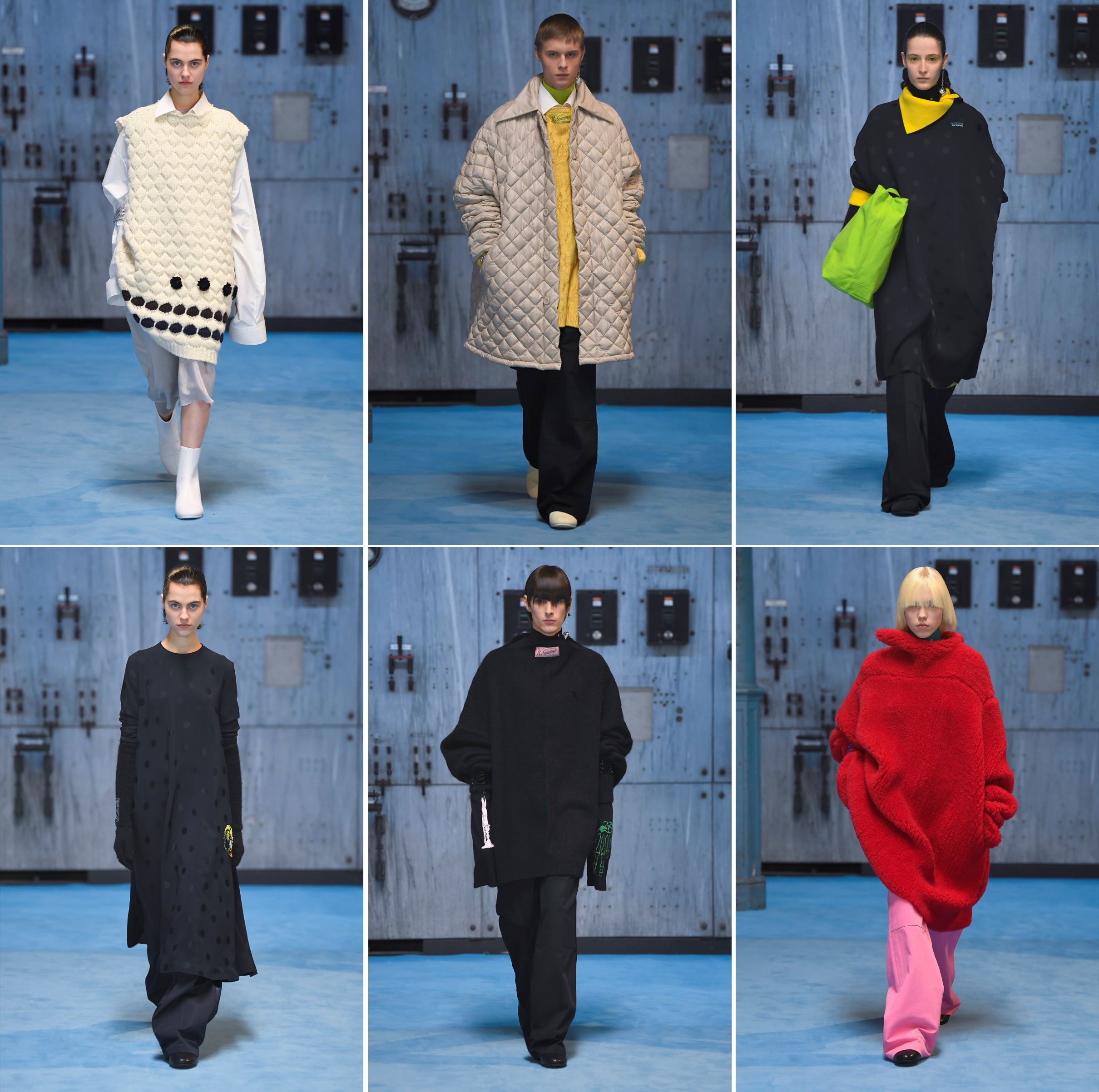
The show is set in a former mine building, now known as C-Mine, in the former mining town of Genk, in the Limburg region of Belgium. Millennials of the party gen before COVID-19 might recognise in C-Mine, the building St James Powerhouse in HarborFront. The Barenzaal’s bunker-like industrial site somehow made us think that the Amphibian Man (The Shape of Water) might appear, rather than Mr Simons’s gorgeous, supple shapes. What struck us was a palpable omission of obvious youth, “solar” or not. These clothes seemed less gleaned from campuses than camps, or more specifically, the groups favouring the less conventional without looking, when dressed, like arrivistes embracing fashion for the first time, or for social-climbing attention.
People do grow up, so do fashion. Mr Simons said in the accompanying notes to the collection—“I don’t want to show clothes, I want to show my attitude, my past, present and future. I use memories and future visions and try to place them in todays world.” Unencumbered by the heritage or archive of a heritage-house-as-employer, Mr Simons was able to just hit the right notes, as he went on with not just marching to his own drum beat, but by striking the drum too. This collection had all the hallmarks of shapes and details that fans love, whether for his own house or when he was designing for another. If you were sold to the intriguing volumes, they’re all still here, this time in a near-cocoon that might be associated with the business tagged haute. This was “attitude” that, despite being forward-looking, had the sense of the palpable present: comfortable and assuring.
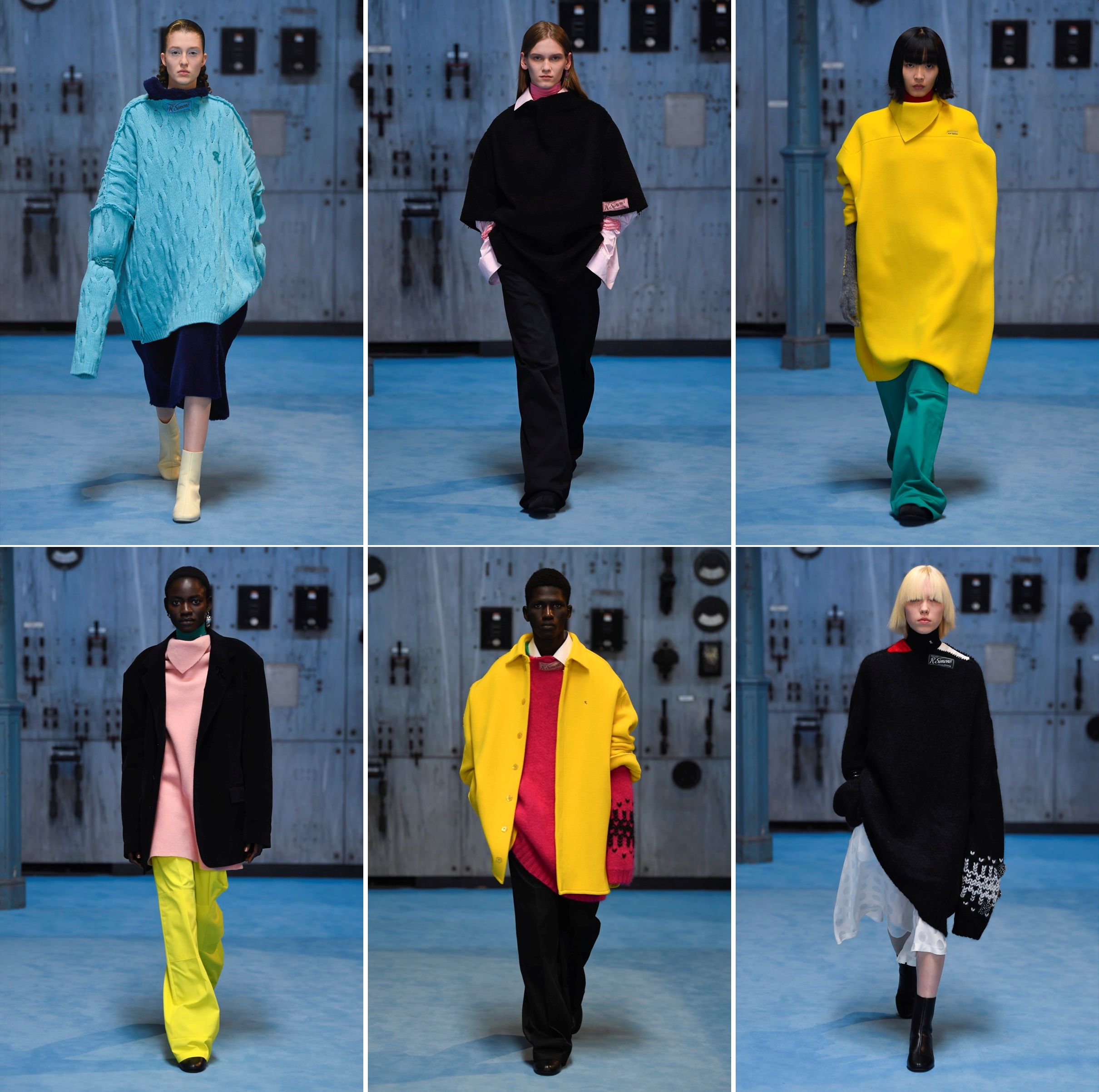

Mr Simons is not only a shape-meister, he’s also a texture ace, creating knits with the surface effect of stretched kueh ambon or forming the diamond-quilts on the coats (with voluminous rear) that could be a remake the 127-year-old British brand Barbour might just need. And there were the colours, too—chromatic pairing that only Mr Simons would attempt. Few could pair brights to black the way he could: always with such electrifying effect, even when the shades were closer to pastels. Who’d think of teaming candy pink with highlighter yellow? And there are the accessories: one skeletal wrist arm-cuff got us wondering. Was this Mr Simons offering the equivalent of the skull? Humour?! And what about those new R. Simons labels that appears even on knitted gloves? Is the brand embracing commercialism? Or, had his experience with the Prada triangle brought something out in him that we know not much of?
This was Mr Simons’s second women’s collection. It’s hard to link anything here to the past, Jil Sander or Dior, although some of the shirts did bring to mind Calvin Klein. Despite the clearly feminine leaning at Dior, Raf Simons is rarely associated with profound femininity and high-octane glamour. Yet, he has a clear sense of what makes striking womenswear that’s sensational, and, at the same time, uncontrived and unforced. We are partial to the tunics and tunic-dresses, so consistent with styles that are knowing and confident. At Jil Sander, one fashion critic once said that Mr Simons was not able to cut the pants well. This season, the trousers looked masterfully executed—with just the slouch that today’s ‘relaxed’ calls for without the too-easy hang-loose of sweat pants. The mood of the moment was truly well, and enticingly, captured.
Screen grab (top) and photos: Raf Simons

[…] and, on the upper, “Morse code-like pattern” (I, and so many of us here at SOTD, prefer the sound), is probably one of the most uninspired interpretations […]
LikeLike
The colours are interesting.
Some of the model presentation showed a 5 colour pallet !
That is not an easy task to handle let alone hoping end user can accept a bespoke colour match because international brands need to color match a wide variety of skin colours, (racist but counter racist) or (pro heritage ultra violet skin response).
Before the days of facebook, the Prada, NY Flagship Store tried to collect data to suit an international end user-ship by the use of the fitting room activities and ethnic background.
This was to consciously adapt their design to suit a wider international fan base:
Colours are interest and hard to co-ordinate! We can go on about how each geographical location inherits a unique sunlight colour because of the angle of the sun and azimuth……………..
LikeLike