…cover to cover. Is it any good? Do we finally get our own voice? Or, is the magazine still shaped by angmo hands?
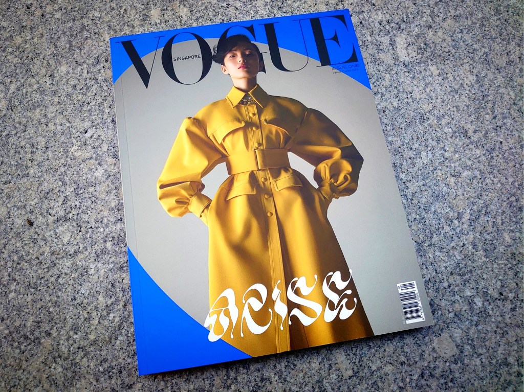
One of the three Vogue SG covers
It isn’t known if there is ever an edition of Vogue, among the now 27, raised from the dead. We dug, but we didn’t find any. So Vogue Singapore is the first. It is also uncertain if there was ever such a short-lived edition of Vogue. When our very first issue—with Joan Chen on the cover, photographed, expectedly, by Russell Wong—appeared in September 1994, no one suspected, although many feared, it would close—just twenty nine months later. We looked into that too: no Vogue anywhere in the world has ever died as a two-and-half-year-old.
In that sense, we are unique. It is here that international magazines have a second chance at life. Some may remember that Elle SG, born in 1993 and killed off in 2018, too, was resurrected—in 2019. But Vogue SG took a longer time to be raised from the dead: 23 years. That’s about a third of the age of Singapore’s oldest and best-selling women’s magazine Her World (60 this year). In these two decades plus, we saw the rise of digital media and the decline of print, and everything between that benefitted from the over-prized tag influencer. Vogue SG’s “Issue One—autumn/winter 2020—” arrives at not just a time that’s drastically changed by a still-raging pandemic (not, to us, “post-”), but also when magazines are increasingly unable to deliver to a reading public that expects stronger content, and more, not less.
Since this is the second time Vogue SG is trying to make it here, we don’t feel we need to check mercy at the front door. Talking about front, the launch issue comes with three covers that editor-in-chief Norman Tan grandly calls “triptych”, a pretentious reference to fine art for a title that has yet to prove itself, fashion-wise, let alone a treatise on art. On Instagram, Mr Tan touts the covers as “collectible”. One cover for a debut issue can’t be cherished enough for posterity or profit through eBay later? The EIC explains in his Editor’s Letter: the three are “to make a clear statement about what Vogue Singapore stands for—beauty, innovation, intelligence, sophistication, diversity, inclusion—as personified by three women hailing from different parts of Asia.”
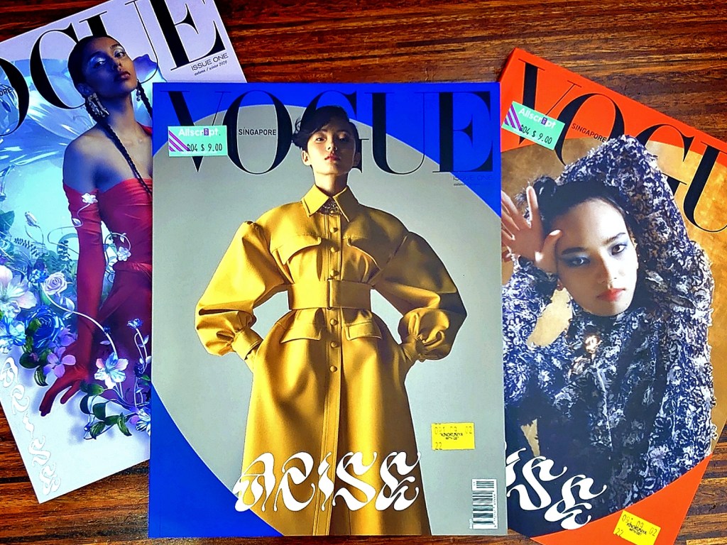
Three is better than one? One the covers, (from left) Diya Prabhakar, Ju Xiaowen, and Nana Komatsu
That sounds like a strategic placement—to go beyond the dot. Singaporean women are not diverse enough; their ethnic plurality, and cultural, inadequate. Vogue SG needs to cast its net further afield. In fact, According to the privately held Condé Nast’s own media statement, “Vogue Singapore aims to establish itself as the region’s go-to fashion resource… with intelligent and impactful content that celebrates Vogue’s new audience in Southeast Asia”. Mr Tan wrote, in the preface to a special, boxed edition distributed to select recipients, promising this elite bunch that they “will experience what Vogue Singapore stands for—thought-provoking stories re-imagined with digital innovation with the people and culture of Southeast Asia firmly in the spotlight.”
Going by the three covers, it seems the title is even greedier: it aims to target the whole of Asia, not just SEA. That got us wondering—would people in Vietnam, for example, read a magazine identified by the city in which it is produced? What about China or Japan (where two of the cover girls are from)? If any of the non-English-speaking countries needed an English-language Vogue, would they not read the British or American (or even Australian) version? We reached out to our friends in the region for a smidgen of insight. An art director in Bangkok flatly said “no” to us. “We do read our Thai edition,” she added. One marketing head from Shanghai told us, “Because of my job, I read as many foreign Vogues as I can, but,” she added delightfully in Mandarin, “我们有自己的看啊!” (we have our own to read). Similarly, a manager from a tech company in Tokyo said, when asked, “I do read the Japanese Vogue, although my diet consists mostly of local magazines.”
In fashion publications, we do judge them by their covers. That’s why we remember Anna Wintour’s debut Vogue cover in November 1988, with that Christian Lacroix cross (now favoured by Chanel) or the late Liz Tilberis’s debut for Harper’s Bazaar, four years later, in September 1992, featuring Linda Evangelista, as if catching the third ‘A’, dislodged from the masthead. Ours needed to be launched with a bang, and that means triple the effect, and, hence, the power, the response, the influence? Mr Tan told South China Morning Post that “it’s been tough” and “super difficult”, and understandably so, given the Circuit Breaker restrictions during a time when the editorial department was visibly and delightfully working in full gear, but despite the difficulties, the magazine did not see it appropriate—even prudent—to launch with just one cover.
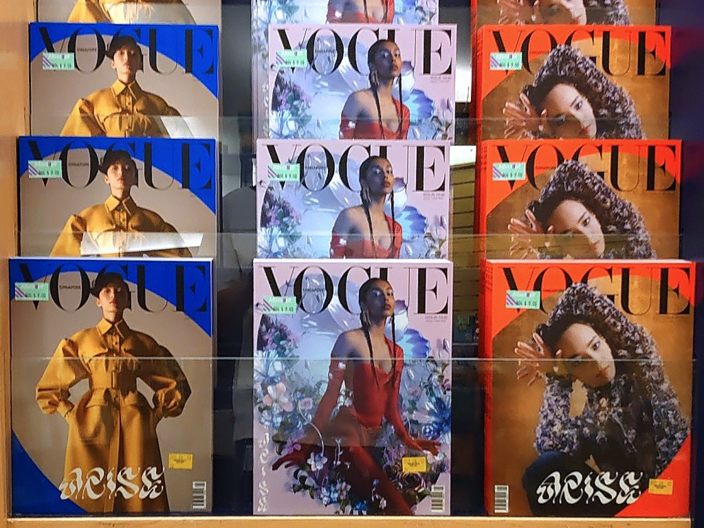
Back issues? Vogue SG strikes with three
More Vogue SG covers prove one thing: there are no Singaporean fashion photographers! All three are shot by foreigners: Singaporean model Diya Prabhakar’s cover was lensed by Canadian Bryan Huynh. Chinese model Ju Xiaowen was shot by New York-based New Zealander Gregory Harris and Japanese actress/model Nana Komatsu by Tokyo-based Chinese Fish Zhang. These days fashion photography is so subjective that it is hard to say which among the three is the best (or the worst), but something can be noted about the need for graphic intervention rather than letting the photographs work alone. All three cover girls are set within an oval, as if to create a counterpoint to otherwise unremarkable photographs. In the case of Ms Prabhakar, she is surrounded by indistinct digital flowers that seem to enhance the coldness of her lifeless expression.
While we can finally call this our own Vogue, the magazine isn’t, in fact, entirely shaped by local hands. Two countries pop up when joining the dots: Australia and Russia. Whether by chance or design, Vogue SG can’t de-link itself from Australia. The ditorial head of both Vogue SGs, past and present, was and is connected to Down Under: first, Nancy Pilcher (Vogue Australia, 1989—1997. Ms Pilcher is, in fact, an American, and, since leaving Condé Nast in 2013, has returned to the United States) and now, Norman Tan, from the coastal city of Melbourne. It is rather ironic that despite critics attributing the first Vogue SG’s failure to its Aussie signature, its come-back is helmed by one who hails from the country from which their Vogue could not thrust ours to greater glory.
Augmenting the foreign-seeming setup is the British art director Henry Thomas Lloyd, who has worked for Love, Pop, and Another, and who fashions our Vogue as if it’s one more alt title. There is also publisher Bettina von Schlippe, a German PR/media executive who once worked for Condé Nast Russia, and was formerly the publisher of Buro, the digital title by Vogue SG licensee Indochine Media Ventures (IMV). She is also the CEO and founder of R.S.V.P Agency, touted on their website as “a fashion & lifestyle marketing communications agency with 16 years of experience in Russia”. Ms von Schlippe is married to Michael Von Schlippe, the president of IMV, the ten-year-old publishing house, founded and based here on our island, with offices also established in Vietnam, Malaysia, Thailand, and the Philippines, and with connections to Condé Nast Russia too, as he had also previously worked there. Ms von Schlippe as the publisher of Vogue SG, in spite of her experience, prompted critics to suggest that nepotism was at play. It is indeed not often that one sees a husband’s name atop a wife’s under the cross-head ‘Management’.
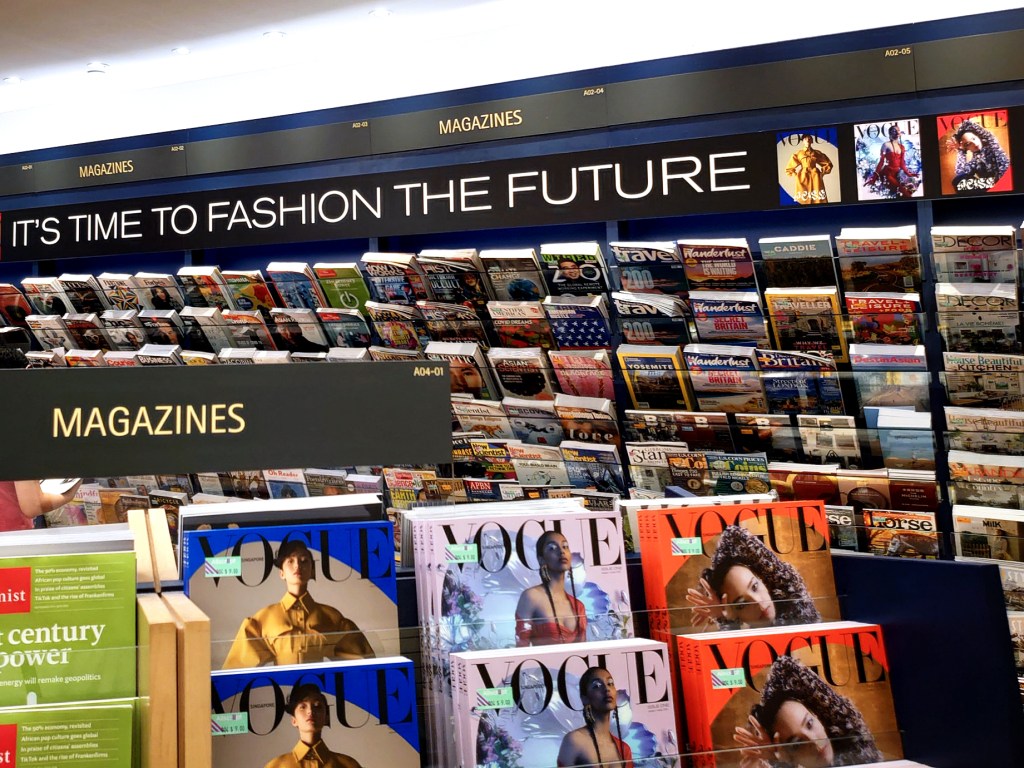
With a marketing budget, Vogue SG made sure it stood out at Kinokuniya
That EIC Norman Tan, ex-editor of IMV title Esquire SG, and a few members of his team are former IMV employees added to the 自己人顾自己人 (zi ji ren gu zi ji ren or “own people caring for own people”) perception—not, in fact, uncommon in the publishing world. Still, this led to some industry watchers wondering if Vogue SG would have the touch of Buro, Robb Report (another IMV brand), and even Esquire SG. For certain, the anticipated magazine is not a Vogue that die-hards would find compelling, breathtaking, and immersive enough to want to rush out to buy a copy, even just to hold. As Mr Tan was involved in or contributed to IMV titles, it wouldn’t surprise anyone if he brought along with him a scintilla of his editorial past. But Vogue, despite its evolutionary changes, is still, foremost, a fashion title.
And it is the fashion in Vogue SG—and how it’s presented—that we find hard to connect. Or appreciate. There is a reason that Vogue goes by the unofficial description “fashion bible”. Nothing in the pages of the SG edition scratches the surface of fashion at its most creative, expressive, and refined, let alone plunges biblical depths. Even Ms Prabhakar’s Balenciaga cover dress is ineffectual, as if it was an afterthought, plonked on her—nothing else fits, this would do. She does not look like she likes wearing it or knows what to with it; she looks the novice that she is (more so alongside the spreads featuring Ju Xiaowen and Nana Komatsu). Mr Balenciaga himself once said, “A woman has no need to be perfect or even beautiful to wear my dresses. The dress will do all that for her.” Not this one.
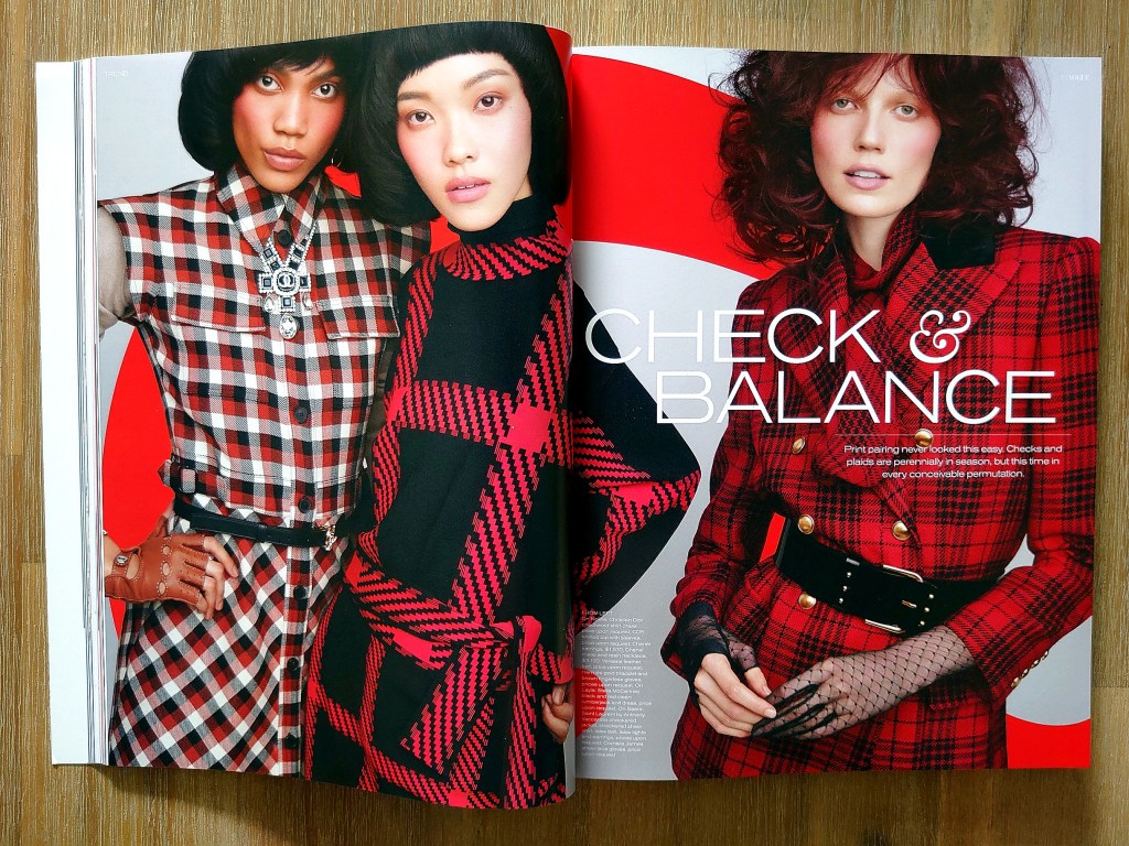
Part reality, part virtuality (spot the QR codes that link you to online content), Vogue SG tries to straddle two sides of the digital divide, but balancing acts, as even gymnasts will say, are not easy to put up. One misstep and you’ll be split the wrong way. The magazine seems so concerned with its cyber-self (another story altogether)—“We love the transportive power of a well thought-out fashion story played out in print, but to add a new dimension to the experience, we’ve engaged the power of digital multimedia,” as Mr Tan wrote in his Editor’s Letter (an odd word choice that, conversely, suggests eras past)—that it feels like a by-product of its online preoccupation. The fantasies or “fashion stories” present a feckless telling, as if everything happens on cyber-streets than real ones. And to enhance its connection to the digital sphere, CGI is applied, as in the jejune spread featuring Ms Prabhakar or the incomprehensible and indistinct digital orchid that tells you the magazine tries—and too hard—to be ahead of the humdrum rest.
We weren’t sure if we are on a page from Vogue SG or Vogue Patterns
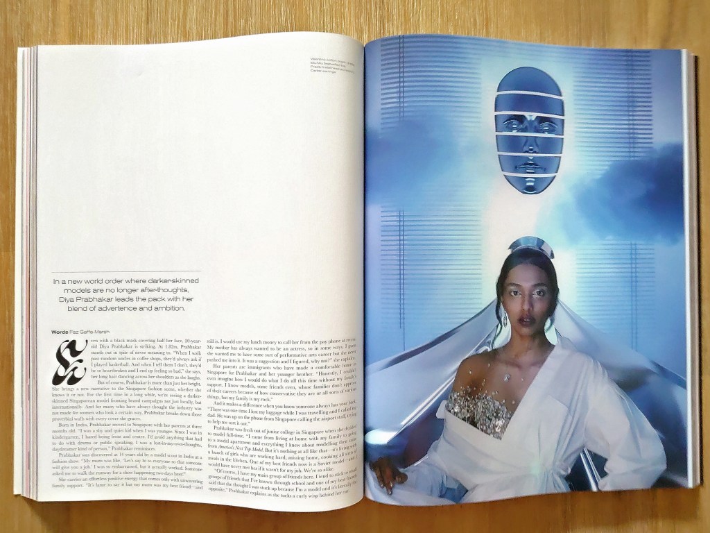
Cover girl Diya Prabhakar looks the modeling novice that she is throughout the spread that featured her
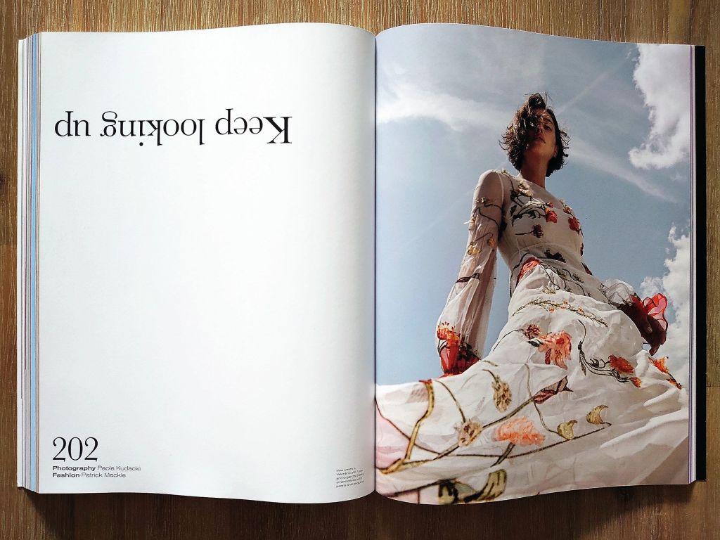
It is not easy to make one’s way through the pages of Vogue SG to the last. Visual irregularities were inexplicably set up to throw you off-course. Odd blank spaces (even when space is an element of design, these still look odd), the narrowest bottom margin, page designs that look like they are from another (lesser?) title—they make one pause and wonder. Need they really do that? One SOTD follower WeChatted us, “less than five minutes flipping the magazine and I am confused. It DOES NOT LOOK LIKE VOGUE (caps, all hers)!” She is not wrong. We were surprised by how random and free-form the magazine appears visually. What is certain and annoying is the palpable need to look cool and edgy, and at the forefront (of whatever)—those qualities that are made ineffable by the shifting nature of fashion. When one tries to make the unfashionable fashionable, there’s a good chance you might be stuck in the former.
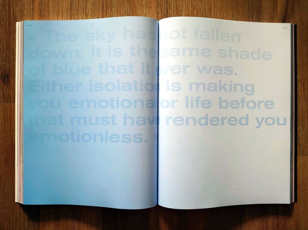
Experienced magazine folks might feel that perhaps the editors did away with the discipline of rigorous page planning. There is a sense that, in order to yield a not-unimpressive 266 pages, many of them had to serve as mere fillers. Content pages, for example, stretched to five (the first, with two columns, does not read from left to right. For all the talk of “innovation”, these extra pages are still an old-fashioned provision of additional right-hand pages for single-page ads). There are also generous two-page intros to sections, pull quotes floating in half-a-page of emptiness, and an essay by Amanda Lee Koe extended over ten when two would be enough—just three examples of injudicious use of space. This stretch-and-stretch approach to filling pages with meaningful content that they probably could not, makes for extremely tiring reading. Not to mention, a total waste of paper.
Perhaps the most irritating, “as you digest this fashion book—artfully crafted with our own Vogue Singapore font inspired by Sanskrit found on the Singapore Stone (a 13th century—possibly earlier—artifact)”, is this very font itself. You first see it on the cover. And it’s not at once easy to read. Hieroglyphs are easier to decipher. Our art director friend from Bangkok said to us, “Don’t you think it’s very Love?” We had to point her to the magazine’s art director. The font is also applied as a drop cap (always hard to read. Why stump the reader right from the start of articles?), to fill spaces, and as background graphic on which photographs are placed. Giving the font a historical reference does not lend it typographical heft. The squiggles, appearing like litter (you’d want to scratch them off!), are perhaps a deliberate contrast to the other oddities: font colour similar to the page, type size of running heads way smaller than the page numbers, both appearing in the same page and, in some cases, page numbers in the same point size as headlines. At this point, we can think of no other expression than the Hokkien geh kiang—roughly, excess of cleverness.
Graphic design book or fashion magazine?
The printer’s fault?
Although Vogue SG, version 1, did not last long, we were, in fact, the first-ever Vogue published in Asia back in 1994, the year we had to pay GST for the first time. Then came Korea in August 1996, Taiwan in October 1996, Japan in September 1999, China in September 2005, India in October 2007, Thailand in February 2013, and Hong Kong in March 2019. And Vogue SG again, in September 2020. We’re now the 8th Asian Vogue. When Vogue Thailand’s first issue hit the newsstand in 2013, it was sold out “within days”, according to The Nation. How our Vogue will fare is hard to say, given the precariousness of the present and the uncertainty of the future. The hope is that Vogue SG won’t suffer a second death.
But its prospect looks a tad dim. Some industry watchers wonder if it augurs well for the magazine to launch with a bimonthly issue (and apparently for the next issue too). It goes by the season: autumn/winter (does that mean that, in essence, there will only be two issues a year?). As far as we are aware, this is the first Vogue edition to debut in such a manner. Two issues of Vogue SG, presumably, for the rest of the year to support an editorial team that has been in place since at least April (if not earlier), when the EIC was announced, is daunting to consider. This led to the conclusion that the editorial team of IMV’s Buro had to be sacrificed to keep Vogue SG afloat.
Carrie Bradshaw had said, not frivolously, “Sometimes, I would buy Vogue instead of dinner.” It is hard to imagine anyone doing that here. We love our char kuay teow too much. The truth is, many of us are buying fewer magazines, even if we might still be reading them. Vogue SG arrives amid the very real declining habit of purchasing and then perusing fashion titles. They would have to be very compelling reasons to reverse that. Given its unspectacular debut, it would require the motivation of rabid fans (do they still exist?) to see the magazine snapped up at newsstands. Unlike Malcom McClaren, however, we simply couldn’t go Deep in Vogue.
Photos: Zhao Xiangji

[…] SG’s first anniversary issue will likely hit the newsstand at the end of this month. A year ago, the title launched a bimonthly issue. They are still out once every two months, which strokes the chatter that IMV has not not made […]
LikeLike
[…] Vogue SG not destined to enjoy longevity here? Or a glorious life? Will the comeback publication meet with the same fate as its former self? These questions followed media reports (even in […]
LikeLike