Serial imitator Philipp Plein is one daring guy to do Dior. If you want to see the real deal, go to ION Orchard and ride an escalator
 The escalator plastered with repeated text of Dior, at ION Orchard. Photo: Zhao Xiangji
By now, you’d have read about one designer who had the nerve to put out something clearly associated with another. Philipp Plein, a German lawyer-turned-designer was recently called out for sharing an image of typographic play on his name which bears an uncanny resemblance to what Shawn Stussy has done for Dior in the current season. For some, it isn’t enough your clothes are not original, your communication material has to be too.
The similarities (see below) are not vague. The text, in flowy/wavy hand-drawn style, placed side by side with Dior’s is as different as Brie and Camembert. Mr Stussy’s flowers are replaced with skulls (its use itself is in clichéd territory), but that differentiation is a stroke of futility. Yet, Mr Plein, a noted bling “king of crass”, to paraphrase Bloomberg, sees his neoteric version good enough to stand on its own without immediately evoking the very recent work of someone else, a noted and just-celebrated illustrator/designer, whose influence is acknowledged by Kim Jones in his pre-fall collection for Dior.
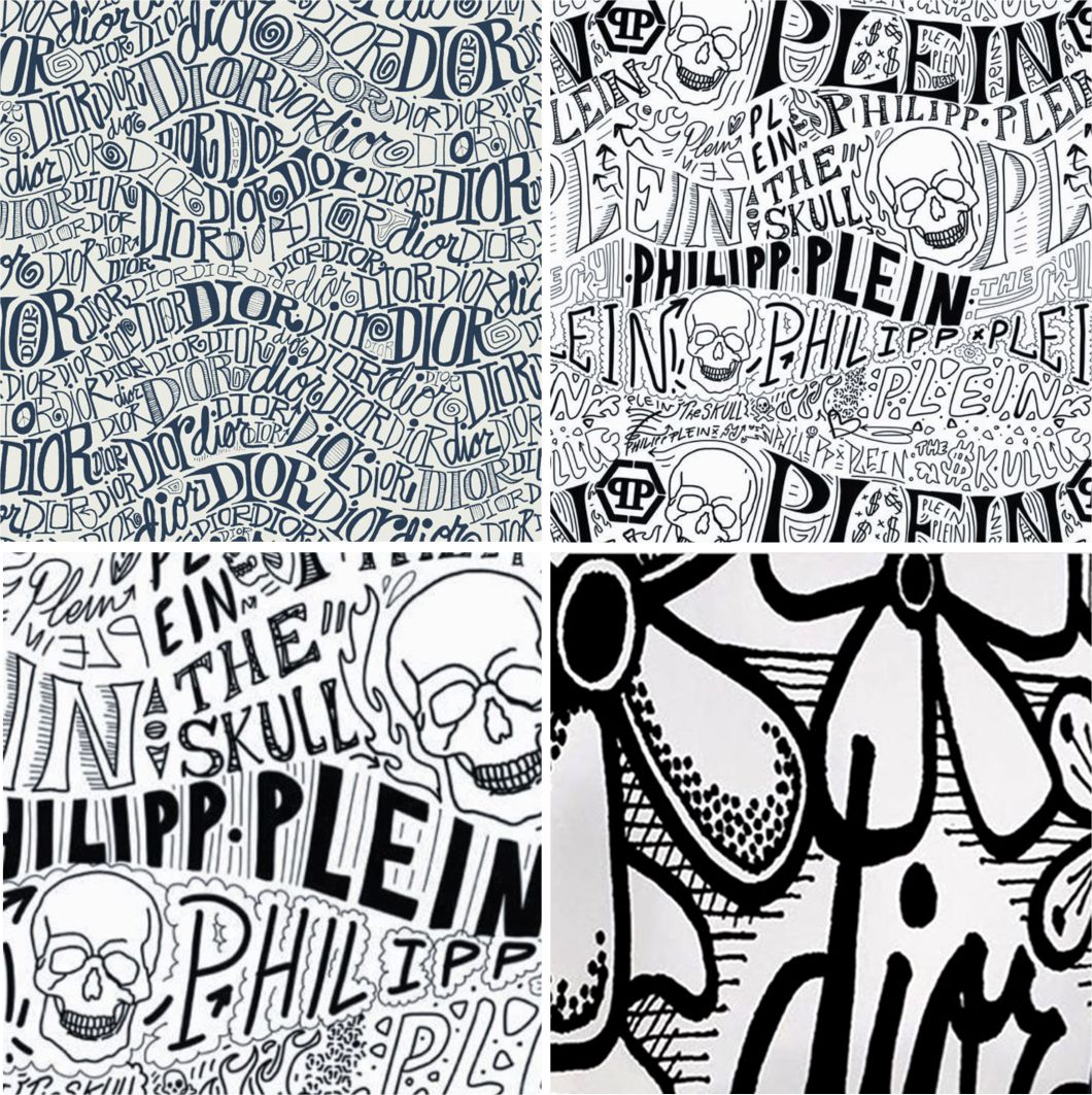 Variations on a theme: (clockwise from top left) Dior, Philipp Plein, Dior. Philipp Plein. Photos: Dior and Philipp Plein, respectively
If you need a close encounter of the original, your best bet is to go to ION Orchard and ride—or look at—the escalator on the first floor, just outside the Dior men’s store. This is striking brand communication. Although advertisements stretched across the balustrade panel of escalators are nothing new (these days, almost anywhere can be ad space), Dior did not use this part of the moving stairway. Instead, it employed the much wider skirt panel (inside which the entire system under the steps is hidden) for the textual pattern that, when seen in its entirety, is almost installation art. No selfie-serving-as-fashion-shoot required.
But for Mr Plein, there may not be the need to concern himself with art, let alone art already created by someone else. For as long as he can amplify what is already illustratively stated, he will do so, and it will be consistent with the label’s inherent crassness. Mr Plein, of course, has a different—not necessarily cognizant—sense of what is refine or sophisticated. His eponymous label, including a men’s wear line branded ‘Billionaire’, represents the excess of wealth and embraces what to many others is plain tacky. Bloomberg quoted the designer saying, “Philipp Plein is a brand that’s very polarizing—you either hate it or you love it.” Which side to take isn’t a hard decision to make.
