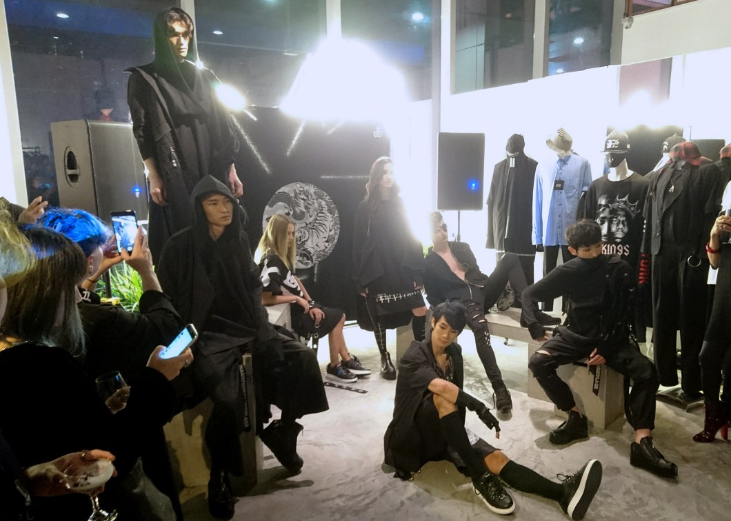
Six months after the Depression boys—as Kenny Lim and Andrew Loh are affectionately known—sent out their autumn/winter 2017 collection during Mercedes Benz Fashion Week Berlin early this year, about a dozen pieces or so from that showing were launched at the designing duo’s multi-label store Sects Shops in Orchard Central last evening. This, as with Depression-related events, is a fan club greet-and-meet, with a token fashion show thrown in, not quite the gathering of the pugilist world (武林大会) that is part of the brand’s neo-Eastern image.
It is admirable that Depression, now in its 11th year, is able to capture the interest and purchasing power of its fan base despite what is willed to be unchanging aesthetic—heavy on darkness and bleakness, but light on cleverness and technical finesse. Called Vol 2: Dragon Vs Tiger, the collection may boast less T-shirts now than blousy tops, but the clothes have not (and probably will never) shed their Goth leaning. Depression is one of very few Singaporean labels that have stayed tenaciously true to its brand DNA: visual cheerlessness. And for that, we’d say the Depression boys have been triumphant.

By now, it is, perhaps, pointless to talk about Depression being unable to escape its propensity for the depressing. They are not going to go jolly suddenly, not at all. Surely in all the gloom, there is a bright spark. Amid the ‘wrongs’, they must have done something right—right enough to come this far. Lest you think we’re going to have a go at them, we are, in fact, going to look at the brand in a way that, as a cheery attendee at the launch party said, “could encourage the boys.”
So encourage we shall. Let’s egg them on to seek therapy in order for them to get out of their decade-long despair. And point to them the maxim “the power to change one’s life lies entirely within oneself”, as stated in their online ‘About Us’. Darkness, you see, does not have to be eternal, just as black as a colour need not project misery, or the macabre. Even if you are, as a Turkish saying goes, “keeping each other’s company on the way to hell”, do stop and smell the roses. But not black ones.

We’ll cheer them on for the visual tact built on Chinese expressions that are evocative of the literary and cinematic genre of wuxia (武侠 or martial arts) and the brand’s apparent appeal to the wuling (武林 or the pugilists’ circle): a small sect of fashion warriors who dress like the Depression boys. This season, their use of the saying 十面埋伏, (shi mian mai fu or ambush from ten sides) is played up prominently—it takes up the entire bodice of one shirt, for example. But there is no surprise attack, visually. This is not the chromatic splendour of the Zhang Yimou film of the same name (known as House of Flying Daggers in English); this is Depression’s usual hack (such as 2014’s 心魔 or evil in the heart)—patently manga, no subtlety or subtitle.
They also need encouragement in the use of more fetching typography. Chinese fonts need not only be in bold face to be effective. They need not appear as if they’re being employed for the movie poster of some cheap Chinese zombie flick. Perhaps the B-grade quality is deliberate or salutary, since Andrew Low is the graphic designer of the two, both having started out in advertising. Still, the people around need not be visually waylaid by the wearer of 十面埋伏. But the font choice is not only problematic for the Chinese text. Depression would like you to believe that what you have bought is “made from a mad dark place” and that proclamation is embroidered noticeably on parts of the garments. Sure, we’re not expecting the embroidery of François Lesage, but must they look like something done in a baseball cap shop in Queensway Shopping Centre?
Depression did, in fact, show some rather eye-catching embroidery other than their usual hard-edge, bad-ass decorative treatment. In keeping with their Dragon Vs Tiger theme, they’ve included a monochrome pair of the heavenly and earthly beasts, each in the shape of a paisley. The keen eye would see that their use is a little belated, considering that the souvenir jacket, on which such embroidery are commonly found, is passé, and a little too Gucci to be relevant or even interesting to their wushu (武术 or martial arts) garb sensibility. And the placement of the motifs—symmetrical and opposite the other, with no animalistic tension—is completely devoid of surprise or edge.
 The hem of a Depression top
We, too, like to encourage them to get a quality control head and a product development manager, assuming they have not hired any, or can’t do either jobs themselves. We have repeatedly expressed our dismay with the make of Depression garments, the finishing, and the choice of fabrics. It is disheartening to still see, after these many years of their existence, uneven hems that refuse to sit flat, seams that pucker (and those that bunch up under the arm), and fabrics that are mostly associated with low-cost garments. It challenges comprehension that pullovers fashioned out of a knit fabric with loopback underside (generally comfortable even if the fibre is synthetic) should require thick-ply polyester lining, and only on one side—either front or back, resulting in a lopsidedness that yields saggy hems.
These problems are compounded by the presence of other clothes from Korea and the US that are sold alongside Depression in the Sects Shop. Next to the imports, Depression looks decidedly slapdash. Beneath the distraction of the exaggerated shapes, Oriental embroidery, and Chinese text, the clothes still show their shaky foundation. Perhaps the other Chinese character used this season is instructive: 忍 (ren, or endure). In view of Depression’s design progress, we really have to bear with the slowness. Haste, in this instance, cannot be encouraged.
Sects Shop is at level 4, Orchard Central. Photos: Zhao Xiangji
