At Dries Van Noten, they proved that even strong brands can’t do without a creative head

We did not expect it to be a sensation. But neither did we think it would be in such a disordered state. Now, without a creative head, Dries Van Noten is designed by a “studio team”, presumably the group the namesake founder left behind after his swan song presentation last June, during Men’s Fashion Week. If that show marked the “end of an era”, as it was widely described then, what did the latest collection indicate? Transition to the next? A re-calibration? A lull? As the models emerged, the hair and makeup wanting, it was clear to us that the brand is operating rudderless. Either that or with too many cooks. Dries Van Noten was always about the mix, the co-mingling of ideas, the global references, and their much-appreciated prints, but this time, it was a mess, a pastiche that hinted at a glorious past that could possibly come to a halt.
When a collection begins with a reptilian-print coat, it’s not always a good sign. That was the case at Dries Van Noten. And then when more animal prints dyed in gaudy hues appeared, it was hard not to link them to the tragic, like flourescent chrysanthemums during festive seasons. Or colourfully-stained pussy willows during CNY. It is doubtful that they would score among a certain set for whom artificial is not aesthetic triumph. The news was that Mr Van Noten had approved every piece in the collection (apparently, the man himself was at the show too, to lend support to his former employees, and he left very quickly on a plane later to return home). Even if that was true, did he agree to how the pieces came together? There was, to us, an over-exuberance in the styling, but the sum was not clever or homage to Mr Van Noten’s “poetic aesthetic”. This was a different rhyme scheme.


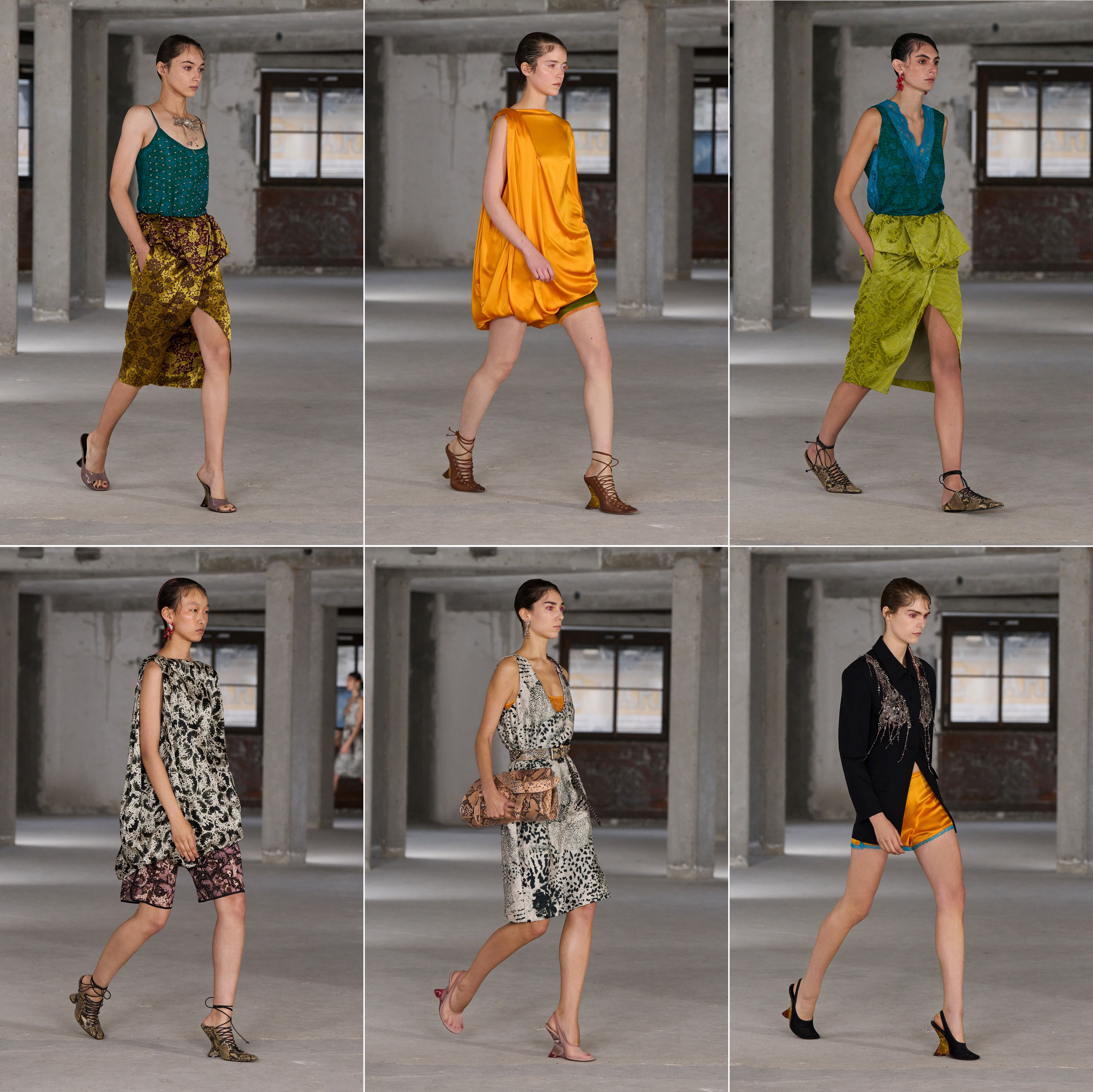
We had thought that the team would have attempted a greatest hits collection, but it was, in the end, how-many-Dries-ideas-can-be-squeezed-into-one-show. There was muchness, but, regrettably, little else, let alone control. Editing is clearly missing as chartreuses jumped among hot pinks and burnt oranges, (more) animal prints battled with studded brocades, crushed silks, and lingerie lace, camisoles jarred against draped skirts and smart blazers. In keeping with the preferences of today’s customers who glean from TikTok what is sexy, there were the very cropped, nipple-visible, lace slip-tops that appeared like narrow tube tops under outers and the lace-trimmed silk satin shorts that looked forced out of the bedroom.
Then there were those pieces that struggled to look flattering. One dirty green floor-length tunic, in particular. Or, the cropped orange version with a twisted hemline. The curious inclusion of oddly-shaped (auntie?) culottes did little to communicate the offbeat that past collections sometimes did with repose. There was attempt to evoke the old Dries layering too—untucked shirts under all manner of outers—but it escaped being as “effortless” as it was when Mr Van Noten oversaw the styling. The sum effect was, to us, very junior designers trying to prove something. According to the brand, “the collection expresses the freedom of wandering for a brief time; a fun step forward that moves to a new groove”. Wandering could mean lost and new groove could indicate inadvertent discordance. And is there not such a thing as taking too much liberty? If Mr Van Noten truly had his own druthers, would he really wanted the collection to look this way?
