One is a Spanish brand, one is Malaysian. How did their logos become so similar?
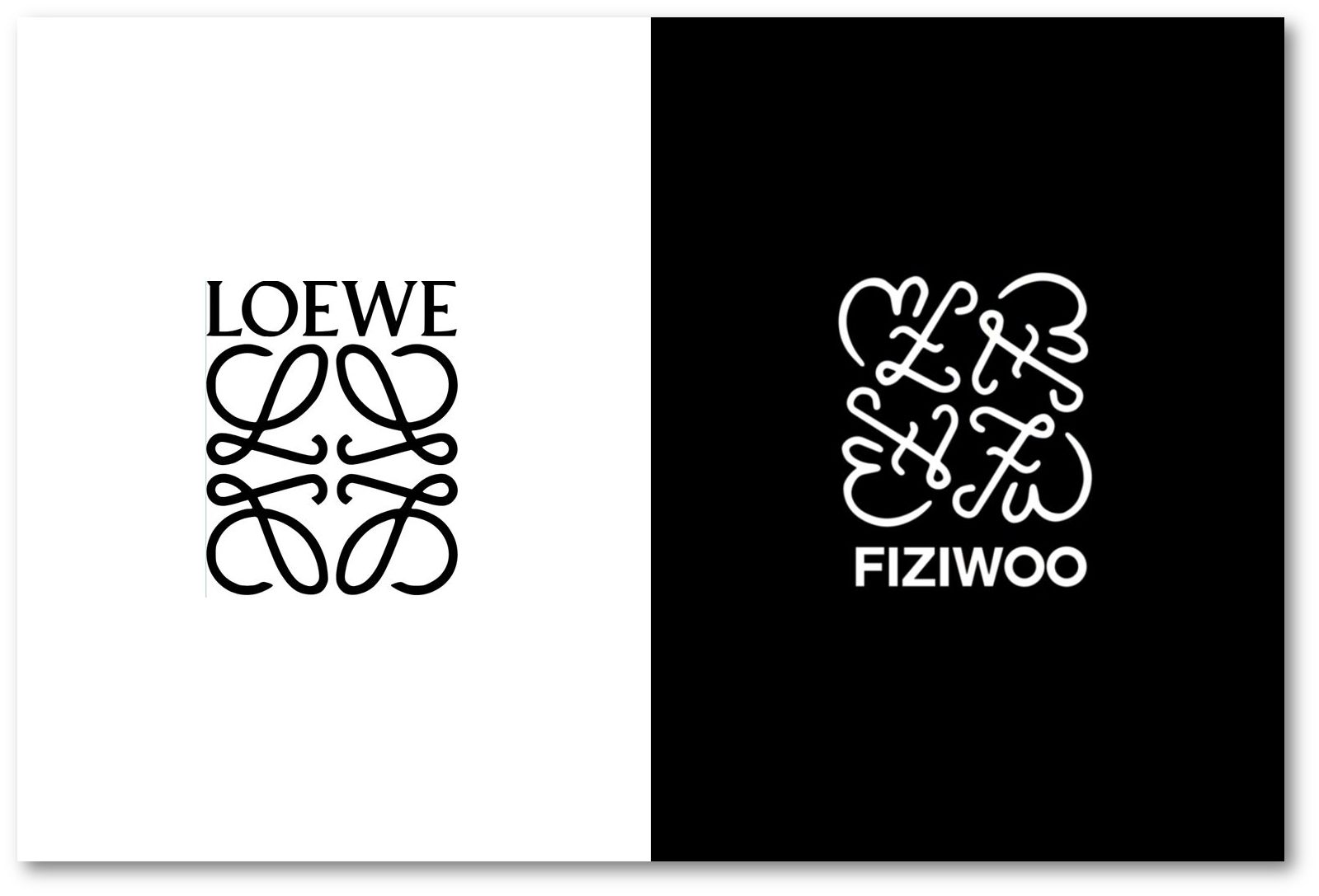
At the recent Kuala Lumpur Fashion Week (KLFW), the self-touted Malaysian “luxury brand” Fiziwoo revealed a new logo, or a refresh of its original logo. On the backdrop of the show’s runway was a monogram comprising the initials, FW, of the brand in cursive font, arranged, mirror-image, to form a square that had an uncanny resemblance to the recognisable one by the Spanish label Loewe, used in its current form since 2014. Fiziwoo’s original logo—also squarish—was far more blockish than the new version, and was as angular and symmetrical as traditional Chinese 回字格花窗 (huo zi ge hua chuang), window lattice pattern, or those similar to the character 回 (hui). It is not clear if the new Fiziwoo logo is temporary or a permanent makeover.
Loewe’s highly unmistakable logo that we see now is, in fact, based on one introduced to the house in 1970 by the Spanish painter Vicente Vela, who named it Anagram, based on a single cursive letter ‘L’, placed as mirror image of the other. According to Loewe, the design was inspired by branding irons, commonly used in identifying cattle, and which was, therefore, evocative of the brand’s roots in leatherwork. In 2013, when Jonathan Anderson joined Loewe as creative director, he initiated a fine-tuning of the logo by entrusting the refresh to the French graphic design stars Mathias Augustyniak and Michael Amzalag of M/M (Paris). The duo “minimalised” the original, using a significantly slimmer font, for a more refined, less rustic graphical representation.
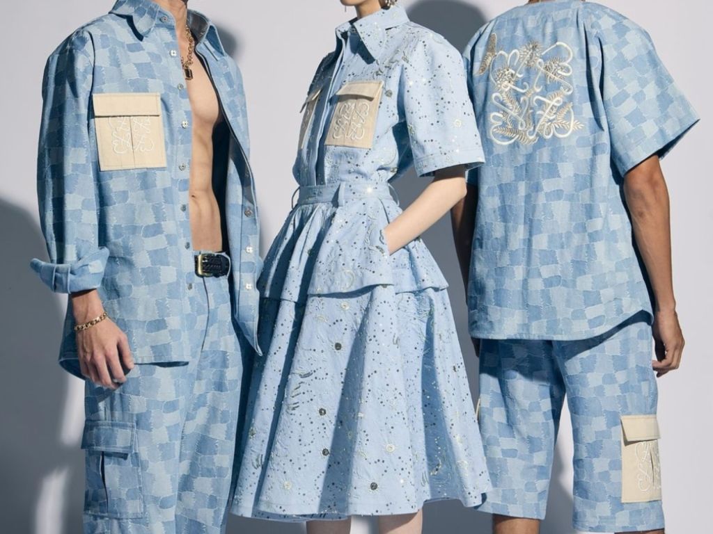
Fiziwoo spring/summer collection, showed at KLFW 2024. Photo: fiziwoo/Instagram
We do not know if the Fiziwoo logo redesign was done in-house or farmed out to a graphic agency. Or, if the brand’s designers Hafizi Radzi Woo and Izree Kai Haffiz are aware of the likeness between theirs and those used by the LVMH brand. There are, of course, differences. The right-side-up initials of Fiziwoo is placed on the bottom right while Loewe’s is on the top left. And the former’s name—in sans serif type—is below the monogram, while the latter’s is above. Regardless, the similarities are startlingly uncanny. Fiziwoo might say that the characters within a symmetrical square layout is Asian. In China, for instance, the square, 正方形 (zheng fang xing) represents stability, balance, and order. It is also the symbol of the four cardinal directions, as well as the four seasons. We do not, however, know what Fiziwoo’s particular textual placement indicates or if it is deeply simbolik.
But the monogram itself was not the only clone. Even how the new Fiziwoo logo was applied on some pieces of their koleksi baru (new collection) for KLFW was inevitably amusing. As it has been with the Anagram at Loewe, Fiziwoo’s new logo is applied (i.e. embroidered) on leather-seeming patched pockets (as opposed to the former’s dot-punched or embossed on calf leather). In a series of chequered denim looks that recalled Louis Vuitton’s jacquard denim version of the house Damier motif, the pocket is placed on both sides of the chest of shirts or as cargo pockets on shorts. The Fiziwoo logo was also embroidered in the middle of a ribbed singlet (roughly where the base of the sternum would be), a treatment also previously employed by Loewe. Flattery can’t be more ardent than this.
Images (top): Loewe and Fiziwoo respectively
