Another magazine left our shores, but is back. What is Esquire SG offering readers this time that will keep them here, at least for a while?
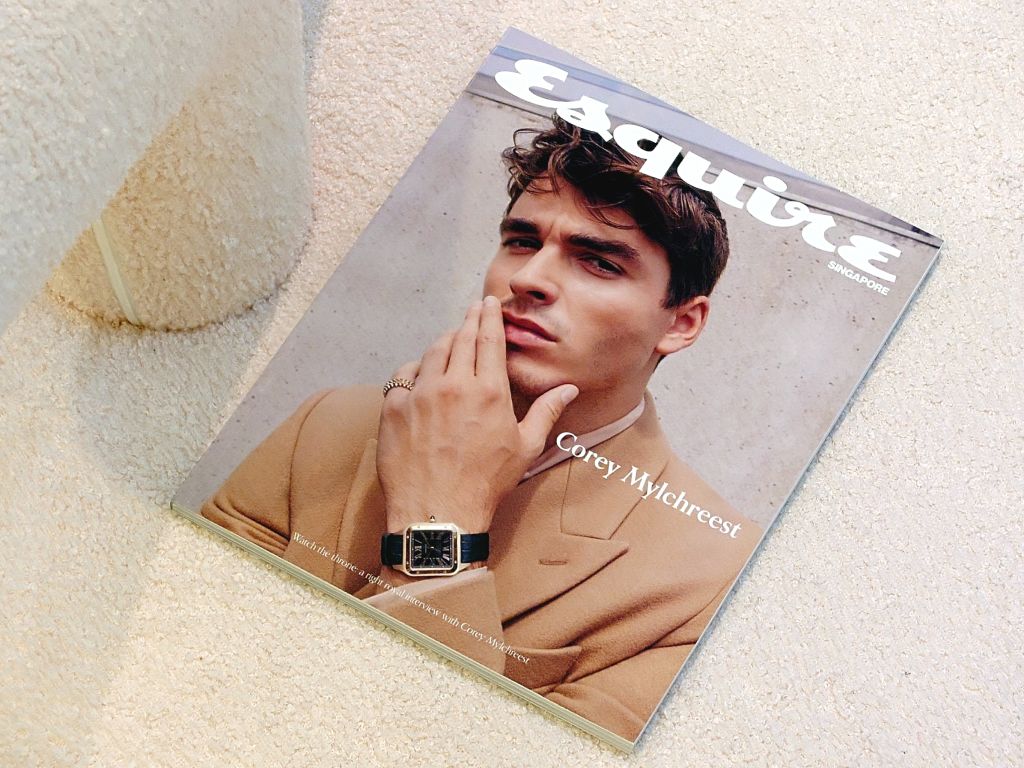
Actor Corey Mylchreest on the cover of the come-back issue of Esquire SG
There is something about our island that is favourable to international magazines leaving us and then returning, like the el niño, but without the trail of an extreme aftermath. The first title that comes to mind is, of course, the especially resilient Vogue SG that survived a near-suspension of their publishing license last year. It could have been their second exit. Now, it’s Esquire SG making a comeback. Last December, the magazine announced that it was departing the market here as publisher Media Publishares, also behind Vogue SG, had no desire to secure the men’s title. They were in favour of holding on to the more glamorous and recognisable women’s fashion bible. Then last April, Hearst Magazines International, the owner of Esquire, announced that the magazine would be back in June, under a new licensing arrangement with Heart Media Group, publisher of Men’s Folio, possibly our island’s longest-surviving men’s magazine.
Although it was announced that Esquire SG would be “relaunched” (Hearst did prefer “re-establish”) last month, the magazine did not hit the newsstand until last week. At the end of June, we received an e-mail from an individual identified as Avid Reader, who wrote: “curious to know what you think about the esquire SG relaunch.” We were unable to reply to the sender and say to them that we had, in fact, been unable to get a hold of a copy of the magazine, as the mail was transmitted via an anonymous e-mail provider. At Kinokuniya two weekends ago, when we were still unable to find the magazine, we asked a staffer if the title would be out. She said she’ll ask her manager, but when she returned, we were told that “it is no longer published”. The first thing that came to our mind was that they were late, which is not unusual for comeback titles. But a June issue still not available at the end of that month is a disregard of the periodical’s chronological commitment.

EIC Wilson Lim’s ‘Editor’s Letter’
When we were finally able to purchase a copy yesterday, we immediately noted that Esquire SG is now a bi-monthly. Even so, appearing only after the first week of July would have been, in the good ’ol days of print media, considered tardy. For a relaunch, the magazine was oddly not conceived to standout in the newsstand. The pale-hued cover features British actor Corey Mylchreest who played King George III in Queen Charlotte: A Bridgerton Story. That a relatively unknown actor was picked to front a magazine making a comeback perhaps indicates how restrained the publishers wanted the return—or what new editor-in-chief Wilson Lim calls the ”restart”—to be. Below the masthead, on the right, is the small, full-cap text that identifies the edition, yet the cover gives no hint as to what a Singaporean men’s magazine might be like. The cover was shot by British photographer Zoe McConnell in the UK, and styled by compatriot Thea Lewis-Yates. Are all our creatives dead?
In a peculiarly emotional ‘Editor’s Letter’, in which he shared that he has “a love-hate relationship with journalism”, Mr Lim wrote that he was initially hesitant to take on the role of the EIC ”because I was terrified of pouring my blood, sweat and tears into something, only for it to be put under a magnifying glass of brutal critique”. Dramatic. Desolate. Disheartening. It is not clear why even after all the efforts that involved the discharge of major bodily fluids, Mr Lim would still submit to the overmastering anxiety that his output would not stand up to scrutiny, which he firstly assumed would be especially savage. Did putting himself in a vulnerable position mean negating the possibility of a ferocious attack? A magazine is generally put out for the enjoyment and edification of its readers and if those goals are not achieved, should perusers keep quiet? Dodging criticisms is, however, not the answer, as Mr Lim quickly realised, stating, “this magnifying glass was exactly what I needed all along.”

The single, locally-shot fashion spread lensed by Joel Low and styled by Sharon Tulasidas
Like the relaunch of Esquire SG, Mr Lim, too, was making a comeback, having left editorial work some 18 months ago. He started his career with the Burda Group, as assistant to veteran stylist and pal of Zoe Tay, Johnny Khoo. The celebrities made over by Mr Lim and the fashion spreads appeared in Prestige, the Chinese version 品 (pin, also Pin Prestige), and August Man. The images—generally must-be edgy—betrayed not where his training came from. He joined Heart Media in 2018, and was appointed Men’s Folio’s fashion director. In less than a year, he was promoted to title’s EIC. He left the magazine in 2021, and is now back at Heart Media, with an additional appointment—the “associate publisher and group metaverse development director”. Mr Lim, who is proud of his trim, tattooed body and is agreeable to posting photos of himself shirtless on his socials has, interestingly, chosen a photo byline that showed him considerably clothed.
In an era when international editions of magazines share resources or draw from centralised content output, Esquire SG is, as a result, regrettably unable to forge a product that speaks resoundingly of its Singaporean co-branding. Although the cover model is sufficient hint of the content’s global leaning, the features inside still disappointed by a glaring lack of local focus. The sole Singaporean featured is 43-year-old doll collector Jian Yang, who is preceded by an actual doll—Barbie’s supposed love interest Ken! Among the four fashion spreads, only one is produced here—the work of photographer Joel Low and long-time stylist Sharon Tulasidas. Even the title ‘Summer Triangle’ makes more sense to readers in the temperate zones or mid-latitudes. Although the average daily temperature in the upper range in June and July is 31℃, with the Meteorological Service Singapore reporting a June average high of 34℃ this year (even one “free balling” piece in ‘Agenda’, written by a doctor, speaks of how “nine sweltering minutes” later and “crotches had been exactly like sweat-drenched, heat-generating boxers in a bunch”), the fashion spread featured a leather blazer, a suede shirt, and sweaters, even one ankle-length piece with turtle neck! Between those were double-pages of first a blurred scarf and then an open-neck shirt that showed only the collar and one sleeve.
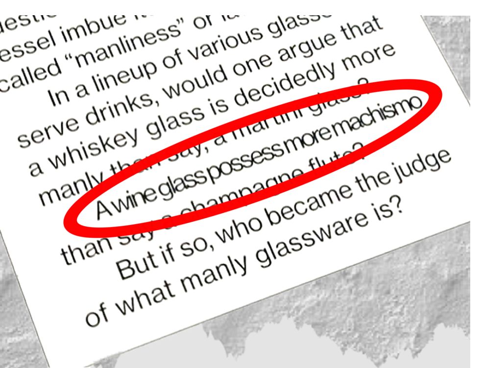
A layout quirk? But text that are squeezed together makes terrible reading
We did not, as Mr Lim feared, place a magnifying glass over Esquire SG. But just a casual read—while watching The Witcher 3 on Netflix—drew our attention to what could become editorial norms. However hard, Mr Lim tries to make Esquire SG a meaty read, he could not, as is the case with many magazines editors these days, resist the small bites. In fact, so small some of them are that they appear to be page fillers. In the first quarter of the magazine—usually the most prized part of fashion publications, where advertisers choose their preferred spots (usually on the right page)—there is the ad-free section ‘Esquire 10’. Occupied by expensive products to make brand managers and their PR counterparts happy, they feature a single product on each page—even a bath towel, described as “the ultimate beach accessory when you go basking in the Tuscan sun”. It is not immediately clear to whom Esquire SG’s is speaking to. Or who it hopes to lure.
Curiously, the 560-gram, 200-pager reads like Heart Media’s own Men’s Folio and World of Watches (WOW) cobbled together, with stories of presumably what men today are interested in: cars, boats, “manly cocktails” and attendant “manly glassware”, or, unsurprisingly, timepieces. In fact, more than two dozens wristwatches were featured in the editorial. Out of the startlingly low number of ad pages—just 18 (including the back page), 12 are taken up by watch brands (that’s more than 65 percent of total ad count), not to mention a conspicuous Cartier Santos worn by the cover star. It is easy to skip all those pages if one does not have a deep interest in watches. When the text catches your attention, one visual oversight is recurrent and downright irritating. For some reason, the art direction necessitates that justified text is employed, and placed into three, 45-mm columns on each page, with galleys between them unnecessarily wide—10mm (the average in magazine layout is about half of that), requiring the text in many passages to be squeezed, sometimes an entire length within the column. Is it not a disservice for a publication to make its readers squint, repeatedly? Physical magazines are no longer the go-to medium for content consumption. Esquire SG is not making the case for compelling reading or visual enjoyment, even when EIC Wilson Lim is certain that “there is more than one way to approach anything”.
Photos: Jim Sim
