Will Gucci abandon the retro-geeky excesses of the past? Still early to say
Gucci and a certain retro vibe are so hard to unpick that it is almost unimaginable that they would move forward by totally abandoning the past-is-better exuberance of Alessandro Michelle, on which the brand’s latter-year successes were built upon. Even after announcing the hiring of their new designer, Sabato de Sarno, formerly from Valentino, the subsequent collections have not shied away from what the brand is known for in the past two, news-making decades. But the latest men’s collection for spring/summer 2024 (with no runway show, just pictures sent to the media) may hint at the taming of the shrill, when Mr de Sarno’s debut collection will be unveiled in September. The present pieces are likely conceived by the in-house team, with input from the new guy.
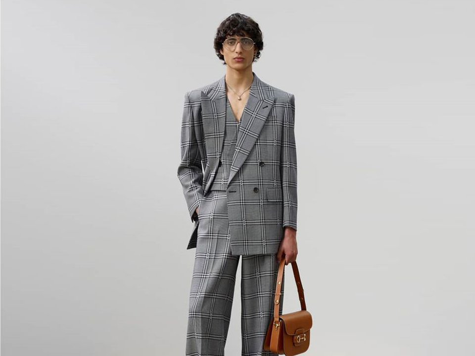
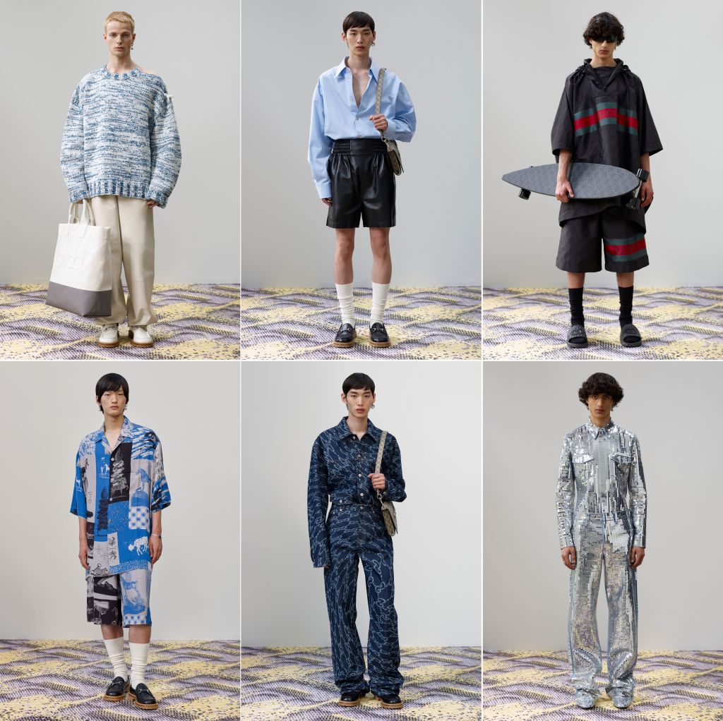
Gucci will never be a minimalist label. It is, therefore, unlikely that Mr de Sarno will turn it into, say, Jil Sander. Or, totally strip away the gaudiness, itself already embedded in the ‘house codes‘. However much Kering desires their top brand tweaked, it is not likely they want it totally overhauled. Yet, from the 20 looks, shot against a plain grey wall, with models (surprisingly not too geeky) standing on a subtly-patterned, pastel-hued carpet, we sense a newish direction. We also sense restraint. This is vastly different from the resort 2023 collection that Gucci showed in Seoul just a month ago. Then, it was Gucci untainted, made more street with pretentious skate-wear sensibility. It is amazing that they could go from that to this.
By this, we mean a coolness that still has an offhand touch. This is not a collection that will generate grails, but it can offer clues to what will come next, and, at the same time, some wearable threads to buy. Sure there are no embroidered animals in the pieces, but fans of Gucci are unlikely craving for them since they already have them. There is a Gucci-logoed top, with the familiar red-and-green stripes across the chest and the treatment repeated in the left leg of the short. That’s the loudest look, presumably included so as not to alienate those who must see the massive logotype before they consider anything deserving their purchase. And, of course, the monogram, this time in a rather subtle tone of grey, as seen in a jacket and a matching pair of pants.
To be sure, we are not opposed to prints or repeated patterns. In fact, we find the pyjama style ensemble of open-neck shirt and matching shorts with the repeated image of the house’s famed horse-bit, depicted like some ice carvings and placed diagonally, to be rather fetching. The appeal is because it is not at once obvious. Others in the line-up that deserves a close look when they are available in-store are the (again) matching tops and bottoms in a technical fabric that could be a distant cousin of the Mylar blanket. It is, of course, hard to determine Gucci’s aesthetic direction with just these 20 looks. But they are an encouraging start.
Photos: Gucci


