When store fronts have to cater to the selfie-obsessed shopping crowd
By Lester Fang
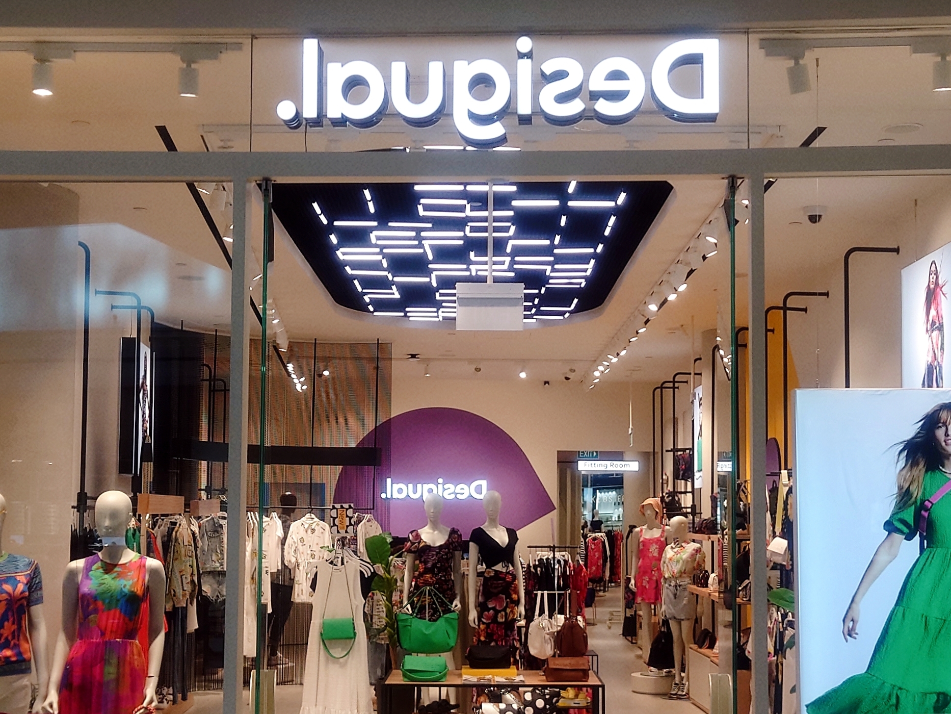
Nope, I didn’t flip this image after shooting it. When I saw this unmistakable Desigual shop at Jewel recently, I thought my eyes were playing tricks on me. Did the shop’s contractor install the brand’s logotype incorrectly? It looked like it was a mirror text. But why? Was it so that only those exiting the store could see the name that made sense? Then I realise the same mirror text in the rear of the shop. This was beginning to appear deliberate. And then it dawned on me that the word that rhymes with bilingual might be in the right order if I took a selfie with it behind me. To he sure, I foolishly took out my smartphone, turn on the camera, and chose the front-facing lens on the controls on the screen. I held the camera in front of me, arms stretched, and directed the lens at the store front, my face way below the phone. And true enough, Desigual was there in my screen, reading left to right, as it should be. Mystery solved.
That the store is in Jewel might have something to do with the decision to flip the text of their brand above the entrance and in the back (their outlet in Raffles City, for example, is not). It is possible that the Spanish brand had designed their shop front in anticipation of the many visitors—selfie-inclined individuals—expected in this mall. The clothier’s unit is situation on the same floor as the arrival hall of Changi Terminal 1, diagonally across from the passageway at which the HSBC Rain Vortex could be seen and is often admired and enthusiastically photographed. They may have, perhaps, hoped that those selfie-takers would make a roughly 180-degree turn and snap away, and among the shops captured, Desigual’s store sign would be read right. Interestingly, Desigual’s first overseas store is here on our island. And it is likely they are the first retailer here to arrange their brand name in such a fashion. I wonder who might follow? Charles and Keith?
Photo: Lester Fang
